Group Beverage Label
Credit also to Leroy S. and Sarah L.
The project was to design a label and logo for a fictional beverage company. Our group chose to do a wine and the idea for a space constellation was met with approval. It was fun and somewhat challenging when working with a group to create a design, but the final result turned out great. I love how the logo turned out.
Main Logo
Main Logo variant
Wine Logos depending on the flavour
Rose
White
Red
On a wine bottle
Orion White Label
Neck designs
Back label
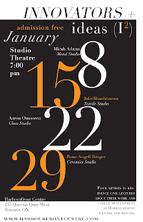
Innovators+Ideas
Needed to create a poster for this event, a lesson on heirarchy of type. Only one font family was allowed.
Self-Portrait
We had to do a self-portrait with about 15 things about ourselves. I dislike self-portraits because I have to keep looking at myself for long periods of time and noticing tiny faults. Anyway, I did a The Saturday Evening Post style cover of me drawing a bird. I dislike how painted-me looked, so here's sans me and just the bird because I'm proud of how that digitally painted bird turned out.
Layout
(Note: it was me standing while holding a sketchbook/drawing and looking at the cardinal.)
Cardinal
CD Project
We were given a list of artists with one of their albums and we had to recreate the CD. I chose to do Caro Emerald due to my obsession with the era she emulates in her music (40's/50's jazz). I never heard of her before but since I listen to that kind of music anyway, I was very familiar with the themes that were common in that style. My teacher recommended me to do a Saul Bass type of style which he seemed to think I nailed in this project. Got a high mark even though I got a 0 on one portion, so yeah he must of loved it.
Cover/Insert cover & back
Insert 1
Insert 2
CD tray/spines
Afterwards we needed to assemble it into an actual CD case:
Don't mind the crack, I just used an old CD case.
Back with one of the spines.
Opened insert, we only had to use one of the insert pages. Also, I didn't bother trimming it...


whoa man that CD looks legit!
ReplyDeleteThanks Christine! It turned out waaay better than what I originally had in mind.
Delete