Alright instead of doing one gigantic post, I decided to split each class into its own.
Digital Media
Life Drawing
3D
2D
Unfortunately, I couldn't find my paintings when I went to the art show this weekend (as well as other students telling me the teacher didn't bring in the assignments during the show into his office). So whether or not I do get them back and if I still have any interest in my terrible paintings, I will post them. If not I can post the drawings/sketches of them instead, although one works better as a painting.

Monday, 30 April 2012
Digital Media
If these are too small here are links for a full page version:
This was our first project involving Flash, and I decided to create a website for the fictional wine company that my group made in 2D class. Everyone loved the transitions when you clicked on the colour banners. Also, that phone number spells "lol-cake".
Flash Website
Our final had to be a professional website, brochure or interactive document that promoted something or ourselves. I chose to do an art website for myself. I went with a green highlight theme because it's my favourite colour. I really like how the icons on the front page turned out. There is also a secret on my info page, with two hyperlinks that link to one awesome secret page.
Life Drawing
This was the other pair to the standing and sitting figures we had to do a couple months ago on kraft paper and white conte.

Creature Design and Skeleton
This was my first time designing a creature and we had to create a skeleton for it. I went for a bipedal mutated humanoid. I referenced the splicers from Bioshock a lot and I mainly did not want toes on mine.

Figuring our the skeleton for this was difficult...

Master Drawing Anatomy
We had to take a drawing from any of the old masters (a lot of people did Michelangelo this year according to my teacher) trace it and do a muscle and skeleton study of it. I chose one of Michelangelo's and we had to label 20 muscles and 25 skeleton/skeletal structures. This project taught me a lot!
Muscles

Skeleton
I really need to work on the pelvis...

Contrast and Portrait
Our final two drawings for the year focused on contrast in the figures. One needed to be a standing pose while the other was a portrait, which I was terrified to do because I have difficulty with portraits.
Model stood for 3 hours...

My camera recognized this as a face...so I guess that's a good thing? I'm satisfied with it though.

3D
Our second project needed had to fit under one or more of the four given categories. All of which had to involve some sort human body part. Mine fit under the the hybrid, body fragmented and social commentary category.
The sculpture portrays our reliance on technology and how it consumes us. I asked a few people and they either interpreted as either being consumed by technology (what I first saw it as) and other saw it as breaking free.
I mainly wanted to use computer parts, especially wires for the arm section and keyboard keys and apoxie for a flesh-y look for some interesting contrast. The hand was made out of apoxie with a foil and wire armature. I was going for the whole zombie breaking through the dirt imagery, and the idea of using keyboard keys as the "dirt" came into my mind. The fingers were also going to be somewhat wirey but due to time constraints and the slightly larger than life size, it would have proven to be too difficult with very little space to work with in the fingers.
Materials used: A pictionary electronic toy, an old power supply (which provided most of the wired and connectors), one keyboard. I also bought an optical drive but I couldn't get it to open for some odd reason, a waste of 5 dollars...
Overall I'm proud of it, could have used more keyboard keys and I liked the messy look I gave the fingers (looks like it's melting of sorts).


Close-up of the wire arm, this was pretty fun to do, but it took longer than I expected.

I hid my name with the keyboard keys, as well as the word "pwn" (not pictured).

It was also at the art show this past weekend!

2D
Group Beverage Label
Credit also to Leroy S. and Sarah L.
The project was to design a label and logo for a fictional beverage company. Our group chose to do a wine and the idea for a space constellation was met with approval. It was fun and somewhat challenging when working with a group to create a design, but the final result turned out great. I love how the logo turned out.
Main Logo

Main Logo variant

Wine Logos depending on the flavour
Rose

White

Red

On a wine bottle

Orion White Label

Neck designs

Back label

Innovators+Ideas
Needed to create a poster for this event, a lesson on heirarchy of type. Only one font family was allowed.

Self-Portrait
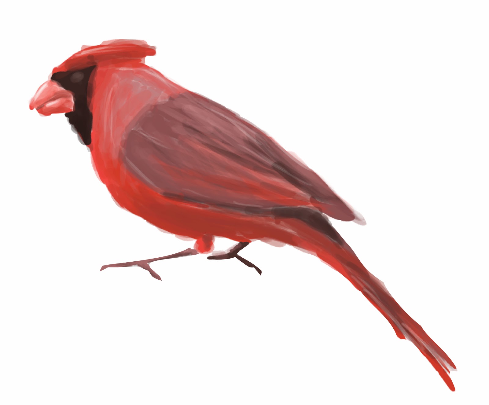
We had to do a self-portrait with about 15 things about ourselves. I dislike self-portraits because I have to keep looking at myself for long periods of time and noticing tiny faults. Anyway, I did a The Saturday Evening Post style cover of me drawing a bird. I dislike how painted-me looked, so here's sans me and just the bird because I'm proud of how that digitally painted bird turned out.
Layout

(Note: it was me standing while holding a sketchbook/drawing and looking at the cardinal.)
Cardinal
CD Project
We were given a list of artists with one of their albums and we had to recreate the CD. I chose to do Caro Emerald due to my obsession with the era she emulates in her music (40's/50's jazz). I never heard of her before but since I listen to that kind of music anyway, I was very familiar with the themes that were common in that style. My teacher recommended me to do a Saul Bass type of style which he seemed to think I nailed in this project. Got a high mark even though I got a 0 on one portion, so yeah he must of loved it.
Cover/Insert cover & back

Insert 1

Insert 2

CD tray/spines

Don't mind the crack, I just used an old CD case.

Back with one of the spines.

Opened insert, we only had to use one of the insert pages. Also, I didn't bother trimming it...

Thursday, 5 April 2012
Portfolio
Well...I didn't get in this year, I found out last friday afternoon. I guess there's always next year...*sigh*. Anyway, here are the apparently bad work I did, except for the the character design because I don't like it and my storyboards. The only thing I got good scores on were my layouts with a couple 4s and my hands.
Here we go!
Life Drawing
(10 min)

This one was the last drawing I chose to put in, I wasn't even sure to add it. But after showing a couple of people my portfolio, they all seemed to like this ball holding man. (3 min)

(5 min)

Animal Drawings
Doberman

Doe

Hand Drawings
I did well on these, I guess those countless Leyendecker studies during the summer and constantly drawing hands whenever I had nothing else to draw came in...how should I put this...handy! (Note: this pun was unintended and I noticed it last minute so I edited it).


Character Expressions
Okay, I'll post the expressions. That was the only thing that I liked from my character. Especially the surprised look.

Object Drawings

Room Drawings


In the end I'm kind of happy I got at least some 4s (one for the object and another for the room [and most people didn't do so well in the layout portion]). But I think I deserved some better marks in other areas. Well there's an entire year for improvement, and I'm super excited about that. I've already started doing some studying again, starting all the way at the beginning by practicing with lines and basic shapes (boxes, cylinders etc.).
I'll be posting what I've been up to during classes this past month in the next couple of days or so. Although some of which I don't know if I'll be able to post, such as my digital projects. Although I might be able to post my mock-up website for a wine.
Subscribe to:
Posts (Atom)