I've been busy with final projects and such, I'll post all about that soon. Unfortunately I do not have pictures of most of my finals, but I'll see what I can do.
In the meantime here's my final project for Digital Media class. We were supposed to do a print design of anything of our choosing. But if we were doing a design for a recognizable brand, company, group etc. we had to get their permission. So it was recommended that we use smaller organizations than larger ones. A friend of mine asked me to do a poster for her radio show, but I unfortunately did not have the time then. To pay her back I got permission from her to do it as my final project! Yay!
Here are 2 versions I made: one 11x17 and the other 8.5x11. I did not know we had to hand in an 8.5x11 while I was working on the 11x17 because I thought of a poster, hence why it looks squished in the 8.5x11.
fausyberries&splee
11x17 version
Fausyberries&Splee
8.5x11 version
I'm very proud of the logo for the show, it turned out better than I expected. I also tried to incorporate her school's colours in the poster, but their colours didn't look that well when there was too much of the yellow on the page. So I kept it only for the important texts such as the title and the schedule to make it stand out.
I wanted it to be a simple graphic poster, but the requirements needed at least one bitmap image and I'm pretty sure the tiny icons at the bottom wouldn't have been sufficient enough to satisfy that requirement. That had me stumped for a while and I couldn't find a good picture of a microphone or a radio, nor did I know how I would incorporate it into the design. Luckily I thought of a pretty decent idea and it turned out okay. I still wish I didn't have to put one in the design though.
Anyway, my last class is tomorrow and then it's Christmas Break! Too bad I'll be spending most of my time working on portfolio work/doing studies. Yay for no rest!
Also, my schedule for next semester is somewhat okay, but it's pretty hectic. At least I got mondays and thursdays off.

Thursday, 15 December 2011
Sunday, 27 November 2011
The Origin of O'ren Ishii
For painting we started oil last week. First thing we did was still lives, mine turned out pretty well but that's at school at the moment. For homework we had to take any scene from a movie and paint it. I asked if we could do videogames and my teacher said it was fine as long as it wasn't cartoony or anything with a unique visual style (I'm assuming this applied to movies as well).
At first I was going to do Half-Life 2's plaza during the intro, then I just scrapped the whole idea. I decided to think of a film that I absolutely adore that also had great composition and was visually appealing. I thought of any Wes Anderson film due to his prominent use of primary colours and 1 point perspective/symmetrical shots, more precisely The Royal Tenenbaums.
Then I thought of the director I absolutely adore: Quentin Tarantino. I first thought of doing something from Inglourious Basterds, but there's that whole Nazi motif that I knew some would get offended. Then there was that dancing scene from Pulp Fiction. But I settled for my most favourite film by QT, Kill Bill. I went with the fight scene with O'ren Ishii in Kill Bill vol. 1, Chapter 5: Showdown at House of Blue Leaves; that scene had tons of beautiful shots it was difficult to choose. Anyway, here are the WIP pics and final:


The final.

Close-up of O'ren.
I'm very proud of it. Sure I can see the many faults in the painting, but I achieved so much of what I wanted I'm proud. I'm proud of the face, except her right eye. And I absolutely love how her left hand turned out it's perfect. I had Leyendecker paintings at the side to reference and it really helped a lot while doing this painting especially the hand. I didn't want to paint it exactly like it is in the film, because then I would have been scrutinizing over it all day. So I looked at the original and just referenced it, but drew it on my own and with a little bit of Leyendecker style.
Let's just say, where have you been all my life oil paints?
Saturday, 19 November 2011
SUPER AWESOME MEGA POST FOR ALL MY CLASSES (excluding Art History)
This past week was really busy, but I got through it. I'll go through each class in order since i had something due.
Painting
I honestly thought I took pictures of my egg tempera painting. Turns out, I didn't. I shall post a picture as soon as I get it back. In the meantime here's one of two boards we made to practice egg tempera on. I'll explain more next time and my opinions about egg tempera.

Although it was just to play around with egg tempera, I started to enjoy doodling on the board. I even began to balance out the composition and colour throughout; I was in the zone. I have to say that I like it, and it is probably my first abstract piece.
Life Drawing

This one, along with another, was the one I handed in for those gestures. I'm not posting the other one because it's not that well done compared to this one and the one I posted last time. I handed it in because it had a face which my teacher seems to want unlike the previous one.

This project was pretty cool. I was nervous to start it, scared that I might mess up. Unfortunately I did. 3/5 of those drawings are great. After I drew the biggest one, I barely had any space hence why there's that awful looking one next to it. But my favourite has to the the far left one.
We also handed in our sketchbook with 10 drawings of interiors with minimum 5 people. Since that's a lot of drawings, I'll save those for another post.
2D
For 2D we had to design a billboard that was for a political issue. My first idea was the perfect one, everything I thought of after that was mediocre. Compared to the roughs we presented the week before, the text was the only thing that changed, I just added some space between each character.
Marco River a Billboard
Marco River a Billboard
I would just like to add, for critique, the class placed the billboards from the strongest to the weakest design. Mine was put first. I'm very proud of how it turned out and I'm glad that everyone loved it.
Also, for this week we learned about type contrast and did a quick in-class activity using random words given to us. We weren't supposed to understand them so that we can focus on the different kinds of type contrast.
Marco River A Contrasts
Second page here ^
3D


For 3D we take something from nature and use aspects of its features to create a container. I brainstormed ideas from turtle shell patterns to create a bowl, to galaxies and comets as another bowl and ashtray. I settled for a tornado-vase-ish thing. My initial ideas had very elegant curves, as I started to go for something geometric my teacher helped improve my idea. Here's what I ended up with:


Made out of foamcore, it consists of 28 squares. A lot of people liked it when we did critique my teacher loved the design choices I made along the way like beating up the edges and crumpling them up to give it a rough look which conveyed the destructive nature of tornadoes. It was meant to be taller and the sides originally went out more. But balance was an issue so the direction it points out aren't as exaggerated. Overall, I'm satisfied with it and I'm glad it turned out better than I thought it would. Here are some WIP pics.


Digital Media
For digital media we started Illustrator and had to either create a map of our school but put a unique twist on it, or a cross section diagram of anything. Most people had regular maps but for different situations. One person had a map about perfect places to go during a zombie apocalypse, another had the best places to sleep in Sheridan. For mine, I decided to go for an old style, Middle-Earth-esque map.
Let's just say I outdid myself and exceeded expectations. It turned out better than I had imagined. Each tree was individually drawn, unfortunately with a mouse. I wish I had a tablet, it hurt my hand afterwards. Once again, during critique, people were amazed and so was my awesome nerd of a teacher. The only issue was some words overlapped some lines (A wing & AA wing) which made it slightly difficult to read, but that was just a minor problem. My map contradicted most of the advice he gave to others, but because of my design it was acceptable (ex. Angled words). I got a ton of compliments and at the end my teacher said, "Other than that I have nothing else to say on how you can improve." Apparently I was the first person to do a map like this. I loved how it turned out so well, I printed two copies. One to hand in, the other for myself.


Sketchbook

A friend of mine had a cartoon tiger he showed me that was in a frontal view, I told him it was flat looking. Without telling him, I started to draw his character in 3/4 view with my own style. Hilarity ensued. The drawing turned out pretty awesome though.

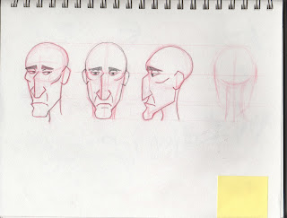
My attempt at a head rotation for my character. Still early, and the front needs a fixing. The back is currently uninteresting, hence why I didn't draw it. I just need to add something more to his head. Maybe hair?

Bored the other night and had the idea of a bird with features that vaguely resembled tribal headgear. The wing area gets a little flat looking, but I had fun drawing entirely from my imagination. It was also to play around with some shapes I found interesting.
Well, that was a lot to go through. I'll try to update soon to avoid another "SUPER AWESOME MEGA POST".
Sunday, 6 November 2011
Digital Media
The biggest project to hand in this past week was an interpretive self-portrait created on photoshop for Digital Media.
We took photos of ourselves any way we wanted and we had to photoshop it into an image that told something about ourselves. Here's my original photo:

The requirements were only to mask it and photoshop at least 3 different things. Me being bored and wanted to go over-the-top with this assignment created this:

It was very difficult to find a good background that allowed me to place my cut-at-the-waist image, yeah the worst place to cut a person off in a picture. This project was actually difficult to do, finding resources were a lot harder than I thought. Not to mention the disturbing images I had to get past when searching terms such as "headshot", "blood spray", and "shot soldier".
My portrait is is supposed to convey my love of videogames. I never though my Team Fortress 2 screenshots would have came in handy for the combat log. Other videogame related assets are the medic call bubble also from TF2, Nintendo light gun I'm holding, the headshot blood splatter is from a Fallout 3 V.A.T.S screenshot and the nametags are reminiscent of WoW's nametags. I also threw in my "internet persona" name "Bluko" in there as an easter egg for the guy being shot.
Life Drawing
We handed in 3 drawings this week, but I do not have photos of those. When I get them back (probably tomorrow) I shall post them. It was an awesome activity, so I enjoyed doing that project. Here are some extra life stuff.

I really like the face for this one. The proportions are slightly off, but I like how I got the slight twist in her body.

This is an example of one of the things we had to hand in. Using a darker colour we had to create a blocked out version of the figure, then draw in the rest very quickly. I absolutely love this kind of gesture, and this one turned out very well. Unfortunately I didn't hand this one in because I thought the teacher would prefer a picture with a face instead. I had a ton done like this, and it was very hard to choose two to hand in.


Some gestures that I like.


1 minute drawings that turned out well. I absolutely love the bottom three on the above photo.

I like how this has an unfinished look to it.

I'm pretty sure this was near the end of extra life so I started to get tired and only draw parts of the body. This one turned out pretty good.
Sketchbook
Doodled a bit yesterday and I created this awesome face that I'm very proud of so I thought I'd share.


This view needs a little tweaking, the eyebrow needs to be a little lower but overall I like it. Character perhaps? We'll see, I've been making faces since the beginning of October and 3 turned out pretty well, this one being an altered version of the second one.
Monday, 31 October 2011
Happy Hallowe'en

Just something I did on my spare time during reading week. I'm thinking of colouring it later on and adding some other stuff to the image, I just didn't have the time to do so.
Sunday, 23 October 2011
New Banner
I finally took the time to create a banner for this blog. Created mostly on Illustrator and a tiny bit of Photoshop. I did quite some research about highway typography and finding the right font to download was harder than it should have been. It's a variation of the logo for my comic idea titled "Bread Crumbs".

Wednesday, 19 October 2011
Mid-Term Madness
Reading week is next week, so that meant a ton of work was due. Thank god I didn't stress out as much considering the ton of work that was due plus an actual mid-term. So I'll attempt to go through what we did but I may be missing some stuff because I forgot to take a picture of them and such.


Stamp Variations and Small
The first is my main design of the toonie, and the second file is of the series and how my stamp would look smaller considering it's a stamp. I did a ton of changes for each coin it was getting annoying. At first I had all the coins similar size as each other in terms of how much of the page it was taking up. But it just didn't feel right. I thought that we're so used to seeing these coins that not only do we differentiate them by colour and design, but size as well. So I had to resize each one (a ton of times) proportionate to the other coins in each stamp. Then it just worked, it's recognizable and easily distinguishable.

We then had to mount it on a 10x15 board for critiquing. I felt like a pro after meticulously placing the prints evenly on the page. It's like I was about to pitch a stamp design to a client. I just noticed now how that is part of VCA (arts and how it can connect to business) and now I understand even more as to why we mounted them...
Anyway, that's what I have at the moment. I still have one final project to do for Friday, and I've been drawing a ton from life since we need 10 interior drawings with minimum 5 people for life drawing. We all thought it was due on monday, but it's actually for the week after reading week (we were all freaking out). At least I got 10 drawings, I'll draw some more (maybe 10 more because I actually want to do more) and post my final ones before handing it in. I'm finally getting used to drawing people in public places.
Painting
We were supposed to do a watercolour painting "en plein air" (an outdoor painting). I decided to do the park nearby my place and I forgot to scan the final but took a picture instead. Either way, I'm not very proud of it and I see all the faults I made which I pointed out during critique.


I really don't like it. One reason is because it turned out too bright, barely any dark colours. Second, the scene looks boring, but I thought the intersection of the paths was interesting from where I was sitting. I agree with my teacher saying that the paths draw our attention to nothing. And finally, it's not really something I don't like, much more along the lines of "this makes it look weird". I was sitting on a bench that's on a slope, which makes this look like the perspective is somewhere in the air, or "en plein air" harharhar. Sorry, bad pun. But yeah, I just don't like how it looks like I was floating.
Life Drawing
This was actually from 2 weeks ago, but there was turkey break so I had no class then. We had to hand in one geometric drawing, one contour and 2 gestures. The gestures were the two awesome ones I posted not too long ago.

This one is the geometric. I don't really like it, I had a better one, but unfortunately I framed that one wrong so one leg went off the page. But that one was better, I had to settle for this one to hand in. I like the arm on the leg on this one though, it foreshortens a bit which was pretty cool to do for this kind of drawing.

Contour drawing, I had 2 awful attempts until I got this decent looking one. I just hate his left hand, everything else is really fine. But I got an awesome mark on this project/portfolio#1.

This one's from extra life after eavesdropping on a friend's tutor and had a revelation. I He was taught how to properly hold the conte and it changed how I drew so much. Unfortunately, this was 1/2 good drawings out of a whole pad. I have some good ones in a pad that's not complete yet, once it is I'll post them.
Our current project is pretty fun, and I hope I get a good version for one of the drawings before it's due, and the other kind of drawing is absolutely fun to do. It's a kind of gesture drawing that I'm really enjoying.
2D
We had to create stamps that represented Canada without using cliches. I had a bunch of ideas like Alexander Graham Bell, Tommy Douglas and insulin. But the phones were pretty boring in a composition, (sadly) Tommy Douglas isn't that recognizable so there aren't many photos to choose from (SERIOUSLY?! WTF CANADA. Tommy Douglas is a hero) and insulin as a stamp would have looked like I was promoting drugs. So I settled for coins when she said we needed a different version or a series after making the main design. I thought a coin series would have been awesome with the colourful gradient background a la Glee posters.
ToonieStampStamp Variations and Small
The first is my main design of the toonie, and the second file is of the series and how my stamp would look smaller considering it's a stamp. I did a ton of changes for each coin it was getting annoying. At first I had all the coins similar size as each other in terms of how much of the page it was taking up. But it just didn't feel right. I thought that we're so used to seeing these coins that not only do we differentiate them by colour and design, but size as well. So I had to resize each one (a ton of times) proportionate to the other coins in each stamp. Then it just worked, it's recognizable and easily distinguishable.

We then had to mount it on a 10x15 board for critiquing. I felt like a pro after meticulously placing the prints evenly on the page. It's like I was about to pitch a stamp design to a client. I just noticed now how that is part of VCA (arts and how it can connect to business) and now I understand even more as to why we mounted them...
******
Anyway, that's what I have at the moment. I still have one final project to do for Friday, and I've been drawing a ton from life since we need 10 interior drawings with minimum 5 people for life drawing. We all thought it was due on monday, but it's actually for the week after reading week (we were all freaking out). At least I got 10 drawings, I'll draw some more (maybe 10 more because I actually want to do more) and post my final ones before handing it in. I'm finally getting used to drawing people in public places.
Sunday, 9 October 2011
School and Sketchbook
Digital Media
So for our first project for my Digital Media class was to create an image out of anything using photoshop. So you can create a landscape using vegetables as mountains and such. Most people decided to do an animal because the teacher used it as an example. But they most of them were cheap and did it on top of an existing photo. But their work was still amusing.
I decided to nerd out like usual, so I started referencing an image from Half-Life 2 with a strider. That turned out pretty unusual so I restarted by recreating the Big Daddy from Bioshock (since a friend was currently playing it and it's my second favourite game of all time).

Painting
For painting we were supposed to create a scene from a list of descriptions the teacher gave us, I chose a swampy marsh. I asked him beforehand if I could use marker to outline and he said go ahead. As long as it is primarily watercolour, he doesn't care how you go about creating your artwork. So here's some work in progress pics along with the final.


I was pretty satisfied with it, I got the look I wanted. But it wasn't until I put it up during the critique session that I noticed how flat the ground looked and only vaguely resembled dirty water, with the bottom of the trees implying it. The teacher even pointed it out when it was my turn to talk about the painting. At least I noticed I mistake, which is good. On the plus side, I got compliments for the look of it. One of them said, "it looks like something from animation" and my teacher agreed, after jokingly saying it wasn't a compliment. It also looks pretty as my desktop background, but I prefer my current Skyward Sword background.
Sketchbook
So starting a sketchbook means a new first page. I decided to apply my "make the first page pretty so you don't get discouraged/disgusted every time you open your sketchbook" idea again. I'll probably do it for every sketchbook from now on. So you must have wondered what my most favourite game is after reading about my Bioshock picture. It's Portal, so to commemorate the recently released DLC for Portal 2 I decided to draw GLaDOS as my first page. I've had the idea of this doodle for quite some time, I just didn't bother drawing it. At first I drew it in pencil, and it wasn't until today I went over it with marker. It just didn't look right in pencil. And yes, I did reference images from Portal 1 to get stuff accurate like the number of disks and the placement of the personality spheres.


Also, Happy Thanksgiving to my fellow Canadians. I shall draw a hand turkey now.
Saturday, 1 October 2011
Life Drawing
So one of the challenges I gave myself this year was to complete a sketchbook in a month (or less). I had a couple of pages left on friday and had plans to draw in the cafeteria. We ended up going to a friend's house during lunch, but returned to the caf for a bit. So I got about 2 pages from that. I then completed the final pages doing some studies, drawing from memory and completed the final page with a doodle expressing my current feeling.
Here a couple of new stuff from my sketchbook:


Here a couple of new stuff from my sketchbook:

This was during a class critique of our watercolour portraits in painting class. I couldn't let the opportunity to draw bored people in class go to waste. Plus, it entertained me during the critique.

I did a couple more like this, this was during an extra life session. During break I would take out my sketchbook instead and draw people. If you haven't noticed yet, I've been taking every opportunity to draw if the chance arises.

This was the final page in my sketchbook. I find it humorous that my last page greatly contrasts the first page in my sketchbook.
Life Drawing
Now here's a couple of life drawings (sans faces) that are okay:


This one I don't like that much, but the pose is pretty sweet, and although messy, I like the lines - it just flows so nicely.

Some awesome gestures.

I really like this one.

Since extra life is currently catering to Art Fundamental students, there were a ton of 30 second/1 minute poses. I didn't want to waste paper so I stuffed as many gestures as I can in a single page. There's a ton more like this, it's just this page looks the best out of all the other ones. I really like the one in the middle of the person reaching up. Heck, someone even said, "That looks awesome. I would literally pay money for that page." And no, he wasn't a fundies student.
***
Speaking of Art Fundies students, during the first extra life session that happened after the strike, a student sitting beside me complimented my work and asked me for advice. Me. For advice. It was an honour. I'm not saying I'm awesome at it, I know I'm not even that good. Passing by the animation hallway always makes me cry, but it made me realize how much I've improved in less than a year. In my second Extra Life session I attended, someone from my program even complimented my drawings too. It really feels great to be told your work is awesome, even though you know it's a piece of crap. Compliments like theirs make me more confident about my work, and I thank them for that.
Subscribe to:
Posts (Atom)