Saturday 14 December 2013

Ball and Tail

This year they decided to give us more work than last year's as per usual. This time we had to make 2 balls with tails or ears and a personality and have them interact with each other in some way.


     Timing on this was the most difficult part. It was a lot of work figuring out certain events that happen at the same time such as the small ball turning and zipping to its destination right in time for the big ball to squish it. But most of the frustration I had when making this was due to the awful Flipbook program we use and not the work itself. I wish someone can create a similar program that's more robust and not lacking basic program functions.

     Through this assignment I've grown accustomed to the motto: "Always Keep Flipping". I always kept flipping, a few people even pointed it out. I also finally got the inbetweening page flipping technique down! But I can't do the inbetween flip like the third year animation teacher who can do it at 24 frames a second. One day...one day I'll be able to.

Wednesday 11 December 2013

Still Lives

Still lives we had to do to study metal surfaces, transparent objects and cloth folds. 

I'm not particularly fond of my cloth in my final but I like how my spoon turned out, and I find it really fun to paint reflective metal. I tried to incorporate the yellow glow that my lamp gave out and reflected on to all the objects. It was difficult trying to make my red cloth still look red rather than orange.

First "small" (only 1 inch smaller than the final) single object study. I chose to do a spoon and used a red folder for the background instead of a cloth for this one. Teacher gave me some advice after doing this such as smoothing the colours inside the spoon and making very sharp edges on the outside. It was really helpful in making the final painting's spoon.

Sunday 8 December 2013

Murder at Mongoose Manor - A 24 Hour Short Film by Studio Mongoose

I created a short film with a group of people! 
And what an experience!


Done in 24 hours straight! It was such an interesting 24 hours and a wonderful experience to create something from scratch with a bunch of awesome people. Even after a month from creating it, I couldn't help but smile during the premier of it on the big screen this past friday.

In the end, with our little group of friends, we called ourselves Studio Mongoose. So here's a tumblr page with some behind the scenes pictures during the production of this short film!

Studio Mongoose Tumblr

Studio Mongoose Team:
Matthew Ramirez: http://ramirezart.tumblr.com/
Melissa Cho: http://cheeeesu.tumblr.com/
Marc Lefevre: http://maclefame.tumblr.com/
Raymond Dunster: http://raymonddunster.tumblr.com/
Kennith Concelos: http://kennith-concelos.tumblr.com/
Kathleen Martin: Blog coming soon!

OH AND WHAT'S THIS?! STUDIO MONGOOSE HAS A PODCAST TOO?!
I present to you the first episode of The Keyframes! In this episode we talk about the whole 24Hour Film making experience.


The Keyframes Youtube Page
The Keyframes Podcast Tumblr

Subscribe, follow, and enjoy the work! Studio Mongoose will continue making some new stuff!
Updated my page with these links on the sidebar for you readers to return to.

Also, have some concept work of the short too!


Here's some early rough work on the character I designed.


Redesign by Kennith


Marc's character. Original in the centre, a refined on the right, and the final design on the top left.


Raymond's character and final by Kennith on the right.


Matt's character and Kennith's redesign.


Melissa's character and Kennith's redesign, it went through another redesign while animating. As well as an early plan of the guest's shapes to find an interesting composition and placement at the table, taking gender also into consideration.

Main character design by Kennith and more explorations.


Colour test I did of Eloise.


Early layout design and final placement of guests at the table so that we were able to start animating.


Wonderful Mongoose Manor design by Matthew.

Thursday 5 December 2013

The Bone Portfolio

Finished 2 days before it was due (yay no cramming!), I am happy with how it turned out. 

I stuck with my first idea of creating a catalog selling bones. So each page about the a certain bone had to be like an advertisement. The most difficult part about creating this wasn't necessarily the drawings or the layout, but writing copy. I now have a giant respect for copywriters, it is not a simple task. I tried to channel my inner Don Draper and Peggy Olson throughout this ordeal.

Most of the design was inspired by old Eaton's catalogs and those old mail-order ads found in vintage papers or comics. I happened to have owned a few very very very old comics with those ads inside, so I kept referencing them.

The skull, vertebrae, scapula and pelvis drawn from life. The rest are referenced from several text books such as: Classic Human Anatomy by Valerie L. Winslow, Complete Guide to Life Drawing by Gottfried Bammes, and Figure Drawing: Design and Invention by Michael Hampton.

Enjoy and don't forget to subscribe to Osteon's!


Sunday 1 December 2013

Wilbur Expressions


Meet Wilbur the Walrus. He LOVES food, especially fish.

I've been craving sushi, hence why I have sashimi in my texture paintings as well. 

Here's some process work:

Original page when I came up with the idea of a walrus character. I always wanted him to have a broken tusk and one decorated. I got rid of the rings around his normal tusk in the final because I found it a tad distracting.

First design. His eyes were on the sides of his head like an actual walrus but it proved to be difficult to pose him with one eye always hiding. Enzo, my teacher, suggested I move his eyes to the front and change the shape of his head to a triangle. He sketched it out but it looked exactly like the walrus from Alice in Wonderland complete with bow tie prop, which I was trying to avoid the entire time (I never even looked at images of him as I worked on this). In the end I managed to find a good shape and design that I was able to work with pretty easily, considering how much difficulty I have with expressions.

Wednesday 27 November 2013

Asteroid Alert

I was on the fence about whether or not I should post this on my blogger. As you're reading this it's quite obvious as to what my decision was.

This may not be the most top-notch short film you'll ever see (forgive the animation, please do not judge my animating skills based on this. There was so much to do in so little time, it didn't even need to be this polished.) but this was an awesome experience to conceive an idea and then manage to bring it to life in such a small timespan. Although this isn't the first short animated film I've done in a short timespan...*cough*checkbacknextweek*cough*

So here's Asteroid Alert:


The entire project was to figure out how to use Adobe Premier, which I must say is an okay program. I prefer After Effects over Premier, but I must say that Premier has better audio editing and a better interface for compiling sequences/compositions. 

Here's a storyboard test, the idea never changed and the plans for them were nearly identical in the final with minor tweaks here and there as well as some omissions due to time constraints:


Here is some artwork used:


Apparently I'm doing well in painting class?!

HOW?! After 3 years of only getting C's in painting, I'm somehow getting better marks in animation painting class, coming from a teacher who isn't so generous with giving out B's. I guess I finally improved?

But even without the marks I'm getting, I've actually noticed that I've improved in painting! So here are the projects we've done so far! Because I actually want to post them! YAY FOR CONFIDENCE! And of course, I'm still learning how to paint.

Basic Shapes and Shading


This assignment was ridiculous because the previous year never had to paint 8 shapes which took a lot more time than you would think, which was a few hours for each shape. So that ate up most of my time.

Gray to Colour Layout


I did another western theme, forgive me for liking the visual motifs in a western.
Also here are the bountiful thumbnails that I created for that assignment.


Clouds


CLOUDS ARE A LOT MORE DIFFICULT TO PAINT THAN YOU THINK.
Even I'm not so satisfied with my final painting (above), but there are still things about it that I like.
And painting thumbnails, a few of which I actually prefer over my final:


Textures


This assignment was something I was afraid of at first but I became super satisfied with the end result. These tiny 3.5" x 4" paintings took a large amount of time considering how tiny they were. I'm not one to mention the amount of time it took to create a piece of art but it sure does put this into perspective. One of the paintings I spent over 5 hours on, I made so many mistakes on the chocolate frosting and macaron paintings but I forced myself to fix them instead of giving up and starting a new one. I'm mostly proud of my corn one, it make me crave some corn every time I look at it.

Mmmmm...corn.

Wednesday 20 November 2013

UPDATED Animated Title Card


Tweaked it a bit and NOW WITH SOUND! Adding sounds properly just makes sequences much better.

Here's the original post with information regarding the design of it if you haven't checked it out yet.

Wednesday 13 November 2013

The Royal Winter Fair

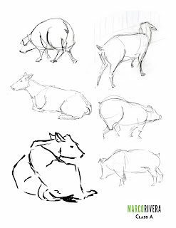
Behold, my winter fair drawings:


The toned paper was grey, not this brown. Every time it scanned it turned it this colour and made it high contrast even when I meddled with the settings. Nonetheless enjoy them.

***

Cleaned up line work of my title page.


My title page is a reference to the Louis XIV portrait by Hyacinthe Rigaud. Sadly, only a few people picked up the reference, the rest at least understood the royal portrait idea. I decided to replace objects in the painting with more farm related items but kept some important things such as the red heels, thanks art history. I also needed poop on the title page because I haven't seen so much poop at once in my life. I almost stepped on a large pile of wet poop that was near the height of my knee.

Apart from the poop, the large crowds and some non-artists scoffing at us and wondering why we can't just draw from photos, it was pretty fun! I wish I could have returned during the weekday, which apparently wasn't crowded at all according to those who went back during the week. I was extremely exhausted by the end of the day as it was such a great challenge, at least we'll be going to the zoo next semester. Thank god I have a membership for that.