Wednesday, 13 November 2013

The Royal Winter Fair

Behold, my winter fair drawings:


The toned paper was grey, not this brown. Every time it scanned it turned it this colour and made it high contrast even when I meddled with the settings. Nonetheless enjoy them.

***

Cleaned up line work of my title page.


My title page is a reference to the Louis XIV portrait by Hyacinthe Rigaud. Sadly, only a few people picked up the reference, the rest at least understood the royal portrait idea. I decided to replace objects in the painting with more farm related items but kept some important things such as the red heels, thanks art history. I also needed poop on the title page because I haven't seen so much poop at once in my life. I almost stepped on a large pile of wet poop that was near the height of my knee.

Apart from the poop, the large crowds and some non-artists scoffing at us and wondering why we can't just draw from photos, it was pretty fun! I wish I could have returned during the weekday, which apparently wasn't crowded at all according to those who went back during the week. I was extremely exhausted by the end of the day as it was such a great challenge, at least we'll be going to the zoo next semester. Thank god I have a membership for that.

Ball Toss


Ball toss assignment. I wanted to do more extra apart from the ball coming from behind and hitting the dude in the head but I couldn't think of a decent idea, plus I have other homework to do since they decided to just pile up the homework now. Ugh.

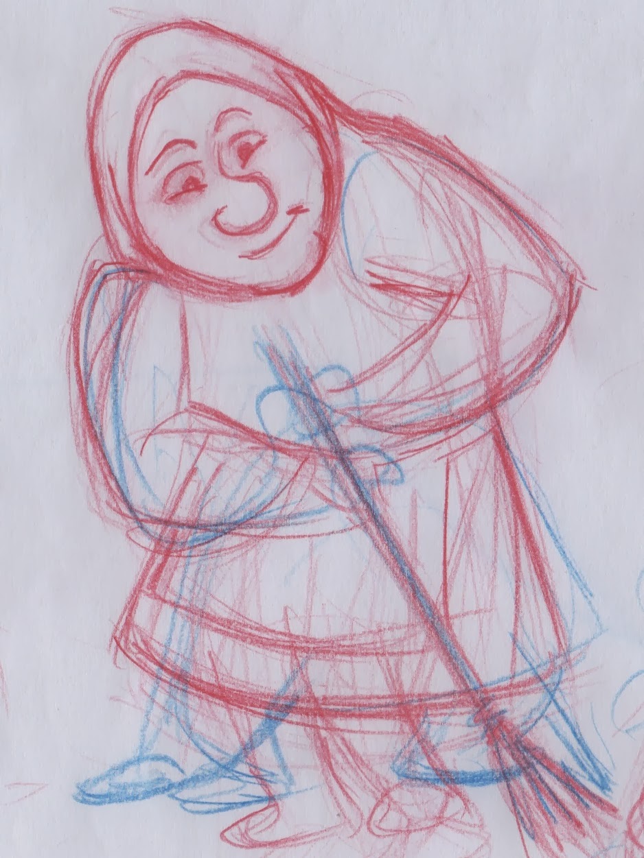
Olga

Meet Olga a lonely old woman who lives in the outskirts of town. She never married and lives a solitary life, enjoying every single minute she has to her own. She enjoys chores the most and staying at home drinking her cocoa.

Sadly, I am not proud of the final results for a few of the poses and I heavily dislike most of my clean up. I decided to try out a different way to clean up my work, it did not translate the way I drew my roughs very well. Lesson learned. Although the poses I liked the most is the one above and the one below where the clean up looked good so I decided to colour them too. So instead here are mostly roughs of a few of the poses that I liked:

Rough

Rough clean up.


Jellyfish

Here's my cleaned up jellyfish!


For digital tools we had to clean up our marine animal assignment. I planned to have flying jellyfish since the start, so I delivered. Unfortunately I had to cut some stuff that I had in mind, such as a trail of sparkles that the jellyfish leaves behind.

One day...one day I'll make a better flying jellyfish that leaves a trail of sparkles...

For animation class, rough with placeholder background.

Rough (pencil clean up).

Digital clean up.


Layout with jellyfish test.

Friday, 25 October 2013

S & C Curves

So I won't be posting my marine animal...yet. I will post it when I am done cleaning it up for digital tools. To whet your appetite, check out my curves...


Sunday, 20 October 2013

Hands & Feet

Here's my contribution to this year's hands and feet assignment in which we had to draw 12 hands and 12 feet.

Please enjoy my title page, which quite obviously draws inspiration from the wonderful Saul Bass. 
Also ignore that it says "class A" on the title page and "class B" in the next pages. It's due to the confusing situation of my group in which we're class B in every class except life drawing, in which we're class A. My mind must have slipped when writing it down.


Tuesday, 1 October 2013

Personal Title Card

We had to create a title card for my digital tools class with our name and class/group. It's supposed to be used for any videos we make such as a demo reel for the year. Since this is the small amount of design work I'm able to do in this program (along with other title pages), I decided not to do any drawings on this. Also it's because I didn't want to do a cartoon self-portrait of myself like what 90% of everyone else is doing for their title card.


I went for a typical cartoon episode title card feel, but give it some sort of agent/spy-like design theme because I've always wanted to try it out. I also tried out the word, "Team Bravo" as you can see here:


But it looked too cluttered and the "S" in "class" has that sleek look that I wanted. The word "group" just looked ugly. It would have been cooler if I was in Group F, "team foxtrot" just sounds badass.


I also added some effects to it. No sounds, but I would like to add some later on and I will also probably come back to it and clean it up a little better.