Heyo! I know I haven't posted here in a while, I'm awful like that. It was mostly due to the fact that I had nothing to post. I forgot most of my 1st semester stuff at school during break, and even right now I still don't have some of the stuff. But I have most of them so here are the ones that I have:
Painting
For our painting final we had to create a scene based on the very very little story details we were given. The story involved some sort of kidnap, people talking, a barn and "The Monkey", which was pretty ambiguous. I imagined it as some sort of interrogation scene, with someone who possessed an important monkey necklace. Most people made "The Monkey" as a person with a possible tattoo of a monkey, since the narrator of the story thought it was a person as well, but it never really stated it was a human.
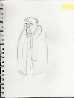
This isn't the painting, but the drawing I did. I preferred it over the final painting. The painting was okay, but I disliked the face so much, although the body turned out well. Unfortunately the painting is at school, I have no clue where it is.
Remember that egg tempera painting we had to do? I finally got it back so here it is in it's awful, messy, eye butchering state. I dislike egg tempera, although I found it as a fun process. Creating the board we painted on, and the process of mixing pigments and such made me feel like an alchemist of sorts. I still hate egg tempera.
2D
We had to create a ransom note while "thinking as designers". Mine was the teacher's favourite because it stood out from the rest. It didn't follow the whole "Gimme ___ or else ___" style. The message was clear and the threat was implied and clearly understood. Plus the "Braaaaains" gave it a natural voice/some personality. I love the poked out eyes the most.
3D
Our final sculpture had to use light in some way. I went with an interactive sculpture. I literally had no clue what to do for the project until the night before which resulted in a lack of sleep and a horrible night that involved my light source's lightbulb breaking in the process and freaking out. All was well in the end.
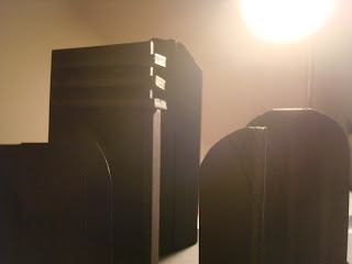
I decided to focus on shadows light creates more than the light itself. So I created abstract shapes on a platform where the light source can be moved to create interesting shadows on a background. This was before the background, I thought it looked sweet.
I decided to go for an art deco design for the structures, or "buildings", because art deco has very sharp and geometric silhouettes and shaped with repeated lines. I thought it would fit very well for my idea. Plus, I absolutely love art deco.
I had to place each structure in a specific area and angle so that some shadows didn't cover an entire building, and the shadows needed to look interesting in different angles. The angled placements of the buildings got a thumbs up from someone and the teacher.
Here's a shift of the light source from one side to the other. The lightbulb was fixed on a small platform in between two pieces of foamcore. The platform was able to move left and right.

I really liked the idea I had, and I thought I got my idea across. Although, I think I could have done it in some better way.
-----------------------------------
Unfortunately my life drawings are still at school because I've been lazy to pick them up. I will soon, and I shall post them...well one of them. The other didn't turn out so well.
I will also post some sketchbook stuff in a bit.


