Wednesday, 27 November 2013

Asteroid Alert

I was on the fence about whether or not I should post this on my blogger. As you're reading this it's quite obvious as to what my decision was.

This may not be the most top-notch short film you'll ever see (forgive the animation, please do not judge my animating skills based on this. There was so much to do in so little time, it didn't even need to be this polished.) but this was an awesome experience to conceive an idea and then manage to bring it to life in such a small timespan. Although this isn't the first short animated film I've done in a short timespan...*cough*checkbacknextweek*cough*

So here's Asteroid Alert:


The entire project was to figure out how to use Adobe Premier, which I must say is an okay program. I prefer After Effects over Premier, but I must say that Premier has better audio editing and a better interface for compiling sequences/compositions. 

Here's a storyboard test, the idea never changed and the plans for them were nearly identical in the final with minor tweaks here and there as well as some omissions due to time constraints:


Here is some artwork used:


Apparently I'm doing well in painting class?!

HOW?! After 3 years of only getting C's in painting, I'm somehow getting better marks in animation painting class, coming from a teacher who isn't so generous with giving out B's. I guess I finally improved?

But even without the marks I'm getting, I've actually noticed that I've improved in painting! So here are the projects we've done so far! Because I actually want to post them! YAY FOR CONFIDENCE! And of course, I'm still learning how to paint.

Basic Shapes and Shading


This assignment was ridiculous because the previous year never had to paint 8 shapes which took a lot more time than you would think, which was a few hours for each shape. So that ate up most of my time.

Gray to Colour Layout


I did another western theme, forgive me for liking the visual motifs in a western.
Also here are the bountiful thumbnails that I created for that assignment.


Clouds


CLOUDS ARE A LOT MORE DIFFICULT TO PAINT THAN YOU THINK.
Even I'm not so satisfied with my final painting (above), but there are still things about it that I like.
And painting thumbnails, a few of which I actually prefer over my final:


Textures


This assignment was something I was afraid of at first but I became super satisfied with the end result. These tiny 3.5" x 4" paintings took a large amount of time considering how tiny they were. I'm not one to mention the amount of time it took to create a piece of art but it sure does put this into perspective. One of the paintings I spent over 5 hours on, I made so many mistakes on the chocolate frosting and macaron paintings but I forced myself to fix them instead of giving up and starting a new one. I'm mostly proud of my corn one, it make me crave some corn every time I look at it.

Mmmmm...corn.

Wednesday, 20 November 2013

UPDATED Animated Title Card


Tweaked it a bit and NOW WITH SOUND! Adding sounds properly just makes sequences much better.

Here's the original post with information regarding the design of it if you haven't checked it out yet.

Wednesday, 13 November 2013

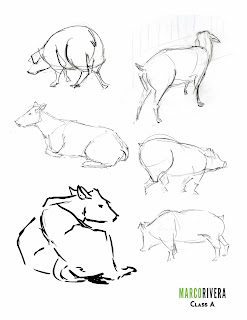
The Royal Winter Fair

Behold, my winter fair drawings:


The toned paper was grey, not this brown. Every time it scanned it turned it this colour and made it high contrast even when I meddled with the settings. Nonetheless enjoy them.

***

Cleaned up line work of my title page.


My title page is a reference to the Louis XIV portrait by Hyacinthe Rigaud. Sadly, only a few people picked up the reference, the rest at least understood the royal portrait idea. I decided to replace objects in the painting with more farm related items but kept some important things such as the red heels, thanks art history. I also needed poop on the title page because I haven't seen so much poop at once in my life. I almost stepped on a large pile of wet poop that was near the height of my knee.

Apart from the poop, the large crowds and some non-artists scoffing at us and wondering why we can't just draw from photos, it was pretty fun! I wish I could have returned during the weekday, which apparently wasn't crowded at all according to those who went back during the week. I was extremely exhausted by the end of the day as it was such a great challenge, at least we'll be going to the zoo next semester. Thank god I have a membership for that.

Ball Toss


Ball toss assignment. I wanted to do more extra apart from the ball coming from behind and hitting the dude in the head but I couldn't think of a decent idea, plus I have other homework to do since they decided to just pile up the homework now. Ugh.

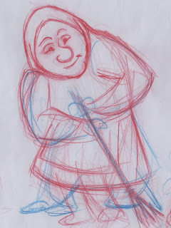
Olga

Meet Olga a lonely old woman who lives in the outskirts of town. She never married and lives a solitary life, enjoying every single minute she has to her own. She enjoys chores the most and staying at home drinking her cocoa.

Sadly, I am not proud of the final results for a few of the poses and I heavily dislike most of my clean up. I decided to try out a different way to clean up my work, it did not translate the way I drew my roughs very well. Lesson learned. Although the poses I liked the most is the one above and the one below where the clean up looked good so I decided to colour them too. So instead here are mostly roughs of a few of the poses that I liked:

Rough

Rough clean up.


Jellyfish

Here's my cleaned up jellyfish!


For digital tools we had to clean up our marine animal assignment. I planned to have flying jellyfish since the start, so I delivered. Unfortunately I had to cut some stuff that I had in mind, such as a trail of sparkles that the jellyfish leaves behind.

One day...one day I'll make a better flying jellyfish that leaves a trail of sparkles...

For animation class, rough with placeholder background.

Rough (pencil clean up).

Digital clean up.


Layout with jellyfish test.