Friday, 16 November 2012

Workshop: Expressions and Caricature

Expressions

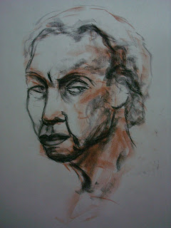
So I've been forgetting to post my drawings from our workshop that we had where we learned how to capture expressions.

SO HERE THEY ARE AFTER A BIT OF A DELAY:

This was the first one we did, each pose was 10 minutes each. The subsequent 2 drawings didn't turn out so well.

This was the last one we did. Everyone kept describing it as "sinister" and "it looks like she's about to kill someone". I'm glad my last one turned out well!


Caricatures

This week we did caricatures. I never really took the time to try and learn how to do one, so the day before workshop during extra life I made an attempt: 

I thought the regular drawing looked too feminine so I stopped and decided to give exaggeration a try. Since the model had such a slender figure, I tried to emphasize it. 

Then another drawing didn't go too well, so I tried drawing his face instead. The drawing on the right was a quick attempt at redrawing the pose but I gave up and did the caricature instead, it still looked pretty cool on the page so I left it.

This was the last one we did in workshop. The first couple of tries were not going so well. It was difficult but I pushed myself to get at least one decent caricature during workshop, and it turned out waaaay better than I had hoped.

Thursday, 8 November 2012

Society Of Fine Artists

So I recently joined a club barely knowing what it was about. As I snuck into another painting class to see what they were doing for their collaborative painting, a person in that class mentioned the group to me and said they were having a meeting the next day. I decided to check it out because it sounded interesting. I won't delve into the details but the group aims to create artwork for outside organizations and ourselves, as well as finding ways to raise even more money for the VCA Art Show. And a couple other stuff.

During the first meeting we needed to design a logo for ourselves. So we decided that we all design one and show each other then pick the best one. They picked mine as the official logo for the group, to be used for letterheads, business cards and more professional stuff. We also melded two designs together to create another logo for a poster board for the club fair that happened yesterday.

Anyway here's my design:
I looked at existing logos for galleries, art museums and other art organizations for inspiration. I noticed that a good number of them had bold white text on a black or coloured background so I worked with that, but I also made sure that the design worked without the black background. So either of these are interchangeable depending on when and where it's used. 

 We also thought it would be cool to have some symbol that represented us and is able to be recognized like some sort of secret symbol that only we understood. So I tried my hand at making one:
The guy in charge liked this one but one person didn't get the design, and they also pasted this on the poster board upside down. It's supposed to be a pencil drawing a line and I honestly think it needs more tweaking due to the two problems. Especially on the pencil but he already took it as it is.
I also wanted to design this so that the colour can be changed, either for events, celebrations, anything of the sorts. So here's an example of it in different colours.

Thursday, 1 November 2012

Collaborative Painting

For painting this monday we did a collaborative piece. I thought at first that it wouldn't be fun and it didn't really accomplish much but as we got into it, it wasn't as bad as I thought it was. In fact, it was a bit enjoyable.

We started off with a theme which was "Evil" because some people wanted it somewhat related to Hallowe'en. Then there were instructions on the board, 3 of which were more technical oriented (make # [shape], make red line, glaze with blue etc.) while 4 other instructions were more abstract ideas (paint something delicious, forest, blind, disease etc.) that we had to incorporate into the piece while replacing it with another instruction.


It was pretty interesting. The woman's body on the top left started out from "two ovals" and someone painted boobs. Then someone made the body from the word "prisoner" and near the end when we contributed whatever we wanted to the piece, someone added the cutting markers and I added the pink handprints on the boobs.

It definitely was interesting, how some parts evolved like the woman's body, while others remained the same. Making the entire piece balanced for ours was difficult since there was too much white, so they glazed it with orange and we were each told to add some more black to it. It was also fascinating to see how the more that was added, people started to consider the entire composition.

My teacher titled it, "Sinner Dinner" since you can read it both ways. I would like to point out that I sabotaged the S and made it into a D because I thought how silly and easy it was to alter it into a different and unrelated word.