Showing posts with label Painting. Show all posts

Monday, 28 December 2015

Multi-plane Layout

Long time no see! I'm back and will be posting some stuff from the past semester. Apologies for the lack of posts but school got busy, then busier, then even more busier. It was non-stop. Anyway I'm back since it's winter break so here's my first update!

***

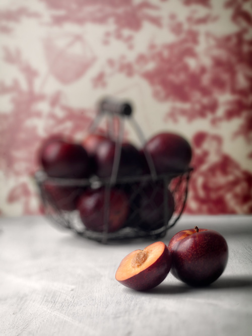
Here's my MLA assignment which turned out way better than I had ever hoped considering I'm not much of a layout guy. I love compositing so putting it together was a ton of fun as well!


Unfortunately my roughs are at school and they aren't open until next week! I will update this post or make a new one when I do get my hands on them again. We had to make a mini pitch package with the concept art we did for it.

Wednesday, 6 May 2015

Final Digital Painting


For our final digital painting we could have painted anything we wanted in any style. I took a previous composition that we used for a layout assignment and created this using the pen tool. I like how it turned out! I might give this way of digital painting a go more often as it's more design-oriented.

Thursday, 24 April 2014

Demo Reel Year 1

YEAR ONE COMPLETE

PHEW. That was exhausting.

Here's my demo reel/a look back at some of the work I did in first year:


It's been one week since I finished school and I already miss it so very much, I want September to arrive already!

 What I enjoyed the most of my first year was the people. They made me enjoy every day at school and made me want to go there nearly every single day. With summer break here there's been people that returned to their respective provinces and countries and it was a pretty sad to go to school the other day to clean out my locker and not see people in the studios. Familiar faces you expect to see right around the corner/station weren't there and it was somewhat crushing.

It's only been a week and I already can't bear this 4 month long hiatus, this will be a very long summer and I'm actually not looking forward to it.

Apart from that I enjoyed year 1 immensely. It was everything that I hoped it would be and much much more. I enjoyed all the classes even ones that I didn't like much (electives don't count) because it was always animation related anyway! There were several instances in the middle of any class where I realize, "Geez, I'm drawing cartoons for school. This is going to be my career." It's literally a dream come true. It was such a surreal feeling to experience, learn and apply knowledge gained from the entertainment that I grew up on.

I HAD CLASSES WHERE WE ANALYZED THE LION KING.

Anyone that knows me knows how much of a big deal that is, it's my all time favourite film and to watch it and learn from it is something from my dreams.

Overall I enjoyed it and I most definitely improved A LOT in drawing and I'm proud to be where I'm at skill-wise, even though I'm known for not being confident enough with my work. I have 3 more years of school ahead of me and a lifetime more in improving. This summer I've already got a few film plans with some friends and an idea for my own. Hopefully they get finished and completed and I hope my own idea works out. I'm also taking an animation course starting May so maybe that might make my summer go by quicker, although it's only until June.

Now I must get back to preparing for next year and getting some well deserved sleep and rest.

Sunday, 20 April 2014

Seahorse Jazz - Character in Setting

Final painting assignment involved making a scene with a character in it. We were allowed to do it with any medium and even take it farther by using cut outs and make it more of a conceptual piece. 

At first I couldn't decide whether or I wanted to make it a painting with an acetate overlay or cut out due to time constraints. With a last minute decision I decided to do it as a cut out because I knew I would regret not trying it.

So here it is done with watercolour paper, watercolour, and gouache:

Seahorse Jazz

I really like how the seahorses turned out in terms of design and construction, I like the silhouettes the most. I really enjoyed going back, cutting out and painting more details on it. I also made sure that in order to give it some 3 dimensional feel to it, I curled the tips of the paper just a bit so that they stick up a tad and only glued small areas so that gaps were still present. The seaweed in the foreground is elevated a bit using small pieces of foam core. Foam core was also used for the border. I knew hoarding extra foam core from previous projects in VCA would come in handy!

Some close ups:


Inspiration obviously from Brittney Lee and Mary Blair, I wish I could be at their level...someday...someday...

Monday, 3 February 2014

Master Copy Painting

For painting we had to recreate an existing painting and also do a tonal study of it. I decided to do one from What's Opera, Doc? because I just love the colour schemes of the many scenes present in that short. 
The most difficult part was trying to get the saturated pink and purple, I spent about 1 hour mixing pinks trying to find the nearest one I can get or an alternative to it. I managed to get a decent pink that was a good substitute, but the purple was more difficult and I had to settle for something else. Apart from that, I think it turned out pretty good! I definitely learned a lot from this assignment mostly about colour values.

Definitely a great learning exercise, I'm tempted to do another one in my spare time. Although this one alone took waaaaaaay longer than I thought it would.

Final

Tonal


Original painting from What's Opera, Doc?


Wednesday, 11 December 2013

Still Lives

Still lives we had to do to study metal surfaces, transparent objects and cloth folds. 

I'm not particularly fond of my cloth in my final but I like how my spoon turned out, and I find it really fun to paint reflective metal. I tried to incorporate the yellow glow that my lamp gave out and reflected on to all the objects. It was difficult trying to make my red cloth still look red rather than orange.

First "small" (only 1 inch smaller than the final) single object study. I chose to do a spoon and used a red folder for the background instead of a cloth for this one. Teacher gave me some advice after doing this such as smoothing the colours inside the spoon and making very sharp edges on the outside. It was really helpful in making the final painting's spoon.

Wednesday, 27 November 2013

Asteroid Alert

I was on the fence about whether or not I should post this on my blogger. As you're reading this it's quite obvious as to what my decision was.

This may not be the most top-notch short film you'll ever see (forgive the animation, please do not judge my animating skills based on this. There was so much to do in so little time, it didn't even need to be this polished.) but this was an awesome experience to conceive an idea and then manage to bring it to life in such a small timespan. Although this isn't the first short animated film I've done in a short timespan...*cough*checkbacknextweek*cough*

So here's Asteroid Alert:


The entire project was to figure out how to use Adobe Premier, which I must say is an okay program. I prefer After Effects over Premier, but I must say that Premier has better audio editing and a better interface for compiling sequences/compositions. 

Here's a storyboard test, the idea never changed and the plans for them were nearly identical in the final with minor tweaks here and there as well as some omissions due to time constraints:


Here is some artwork used:


Apparently I'm doing well in painting class?!

HOW?! After 3 years of only getting C's in painting, I'm somehow getting better marks in animation painting class, coming from a teacher who isn't so generous with giving out B's. I guess I finally improved?

But even without the marks I'm getting, I've actually noticed that I've improved in painting! So here are the projects we've done so far! Because I actually want to post them! YAY FOR CONFIDENCE! And of course, I'm still learning how to paint.

Basic Shapes and Shading


This assignment was ridiculous because the previous year never had to paint 8 shapes which took a lot more time than you would think, which was a few hours for each shape. So that ate up most of my time.

Gray to Colour Layout


I did another western theme, forgive me for liking the visual motifs in a western.
Also here are the bountiful thumbnails that I created for that assignment.


Clouds


CLOUDS ARE A LOT MORE DIFFICULT TO PAINT THAN YOU THINK.
Even I'm not so satisfied with my final painting (above), but there are still things about it that I like.
And painting thumbnails, a few of which I actually prefer over my final:


Textures


This assignment was something I was afraid of at first but I became super satisfied with the end result. These tiny 3.5" x 4" paintings took a large amount of time considering how tiny they were. I'm not one to mention the amount of time it took to create a piece of art but it sure does put this into perspective. One of the paintings I spent over 5 hours on, I made so many mistakes on the chocolate frosting and macaron paintings but I forced myself to fix them instead of giving up and starting a new one. I'm mostly proud of my corn one, it make me crave some corn every time I look at it.

Mmmmm...corn.

Monday, 12 August 2013

Circuit World

I know what you're thinking...
BUT
I didn't think of it once as I worked on these. It was only after did I realize the resemblance...but seriously, how can you not make anything with circuit imagery not resemble Tron?! I was actually thinking about the game Transistor by Supergiant Games, art deco (as usual), and of course computers. 

I thought: what if chipsets were structures? A high-tech temple? What about a city?! And then these happened:


I started with this one first of a basic structure, somewhat temple like, trying to see if the imagery I wanted worked out. I chose the green, grey, and white colour scheme to resemble a basic motherboard with some highlights of colour to give it a glow. Then I started working on the city piece below, then I returned to this piece after painstakingly tweaking the city to make these two work together. 


I thought about how a more "modern" civilization would look with the same visual style of the temple one above. So in a sense, the previous one is of something from the past in that world, and this is an entire society built from that. I also decided that a gradual change in height would look far more interesting than an entire composition of similar buildings. It also gives it a sense of scale far better than what I originally planned.


***

For the lack of a post last week since I told myself I would update weekly this month, I'll be posting more than once (or even twice) this week. So stay tuned dudes and dudettes!* 

*Don't mind me...it's late and I kept tweaking the bottom piece all day.


Wednesday, 31 July 2013

Simplified

Tried out a different style and I ended up enjoying it so much I made two pieces in one day. 

I took some inspiration from My Life as a Teenage Robot, Olly Moss' recent poster designs, and Mary Blair's work. Only after creating my first one did I notice a similarity in style to Samurai Jack...maybe it's because I watched an episode last week. So I also looked at some Samurai Jack backgrounds.

I wanted to play around with very basic shapes, line, and colour and create a setting with a fitting atmosphere.


What started out as a landscape study of mountains quickly evolved into a sci-fi setting with futuristic pyramid structures. I couldn't contain my imagination, it went wild creating these. I even concocted stories behind them as I worked on it.


After finishing the first one I wanted to create another and work in a vertical format and take a more colourful route. This is when I looked at some scenes in Samurai Jack and I noticed several backgrounds had patterns of basic shapes in them (arcs, circles, semi-circles, rounded rectangles, etc.) that either served as texture, something for the viewer's imagination to make sense of, or sometimes for the sake of creating an interesting design and composition. I wanted to incorporate those techniques in creating this piece.

I was thinking of a miniature society with organic-like buildings on the very edge of a pillar. I moved away from a pillar and decided on a cliff instead, it also made much more sense.

***

I am really enjoying this style since it's so heavily design focused. It's also just so much fun to do!
I am itching to create more! I'll definitely expand to slightly more complex shapes as I go along.

Monday, 24 June 2013

Daily Sketches

Lately, I've been participating in this daily sketching forum. They post a theme and you draw something fitting that theme. I decided that this was a good way to warm up so every morning I take about 15 to 30 minutes maximum to create or study something. 

It has definitely helped in more ways than one. It's not just a warm up but it also helps me think creatively, makes me do research, and I try to make myself try something different each time. Whether it's a technique or style it's a great way to see what I can accomplish and what I'm having difficulty with.

Here are the ones that I like. If indicated, titles are in italics and the theme for that particular day is in bold and links to references if used. 

Golden Tanager Study
Colour/Selective Colour

Celebrity Plumbers
Absurd Reality Shows

Handpainting
Messy Spaces
This one is my favourite I've done so far, lots of people liked it too!

Dystopian

Game of Thrones/Medieval Era
*Note: I began GoT a couple of days after this, I feel like drawing something from it now. And all of you people can get off my back now that I finally watch it.

Marty On His Hoverboard
Time Travel

Hedgehogs

Swimcap
Free Draw

Serious Quill
Magic Quill
Feathers

Manly Still Life

Dwarf Fortress

War

Eye Study (of my own eye)
Free Draw

Still Life

*No tracing or eyedropper tool used from the original sources.

Friday, 24 May 2013

VCA Painted Music Video Collaboration - O'Brother by The Snips


For our digital imagery class we were given 24 frames each from a music video. 12 were to be done digitally and the other 12 were to be done by hand. 

We were told to keep the same colours that were found in our frames but people went and did their own thing anyway even when they stressed not to. Turns out the instructors were okay with it, so I was kind of bummed that I kept all my frames similar to the actual video and wished I could have gone a little overboard kind of like a friend's (Kasia Woronko, check her other stuff out while you're at it!) banana-themed frame.

The assignment was too much work to be done in so little time along with other more important assignments, the annoying song, and overall annoying to work on. But to be honest, the final product is actually pretty sweet. It's awesome to see what other people did with their frames (especially the part at 3:13) and how certain parts match up with certain music cues. It definitely deserves to be rewatched several times.

Anyway here are a couple of the frames I did, which are found at the beginning of the video:

Analog Frames (not all of them)


Digital Frames


I preferred my digital frames over my analog ones, even my second digital frame was put up on display!