

Showing posts with label Illustration. Show all posts
Showing posts with label Illustration. Show all posts
Monday, 1 July 2019

Sunday, 14 April 2019
No Cuttin' Corners!
Did some UmJammer Lammy fan art the other week because I was listening to its soundtrack at work all week.


Thursday, 20 December 2018
Titmas 2018
For this year's Titmouse Secret Santa Exchange my person requested a llama with a poncho so here it is!

Tuesday, 12 December 2017
Titmouse Secret Santa Drawing Exchange!
At work we did a Secret Santa drawing exchange and the person I received asked for Teenage Mutant Ninja Turtles so here's what I gave him! He like it! Also really awesome to hear other people in the studio enjoyed it as well.

Tuesday, 11 April 2017
Dilemma Film Poster!
Here's my film poster! AND tomorrow is the class screening!! Super nervous and excited. 8 months of hard work and finally seeing it finished on the big screen is exciting. Can't wait to see everyone else's films too! Then after that it's industry day prep at the end of the month!

***
Here's some of the posters I did along the way towards my final design in the order in which I did them:

Originally I started with the most minimal style I could go for, which was just putting the painting in my film as the poster. A friend of mine was unimpressed with what I was doing and said I should go a little more with it. He was right. He suggested to throw in more shapes so...

I came up with this one quickly. The colours were not intended to be final. He seemed to like it along with some other people but I didn't like how random the shapes were. There was just no reason for those shapes to be there the way they are so I started to just move away from it.

Started making something along the lines of old title cards, Looney Tunes designs, and 60's design. I abandoned it fairly quickly.

Rothko's paintings were one of the main inspirations for my film in terms of composition and colour. So I decided to do the painting of Dilemma in the style of Rothko. I was digging it as I was doing it until someone pointed out that it did not whatsoever convey the feeling of my film. She was right, it looks more gloomy and gritty which is the complete opposite of my film!

So then I went back to my original idea but looked into french new wave posters as well as Saul Bass stuff. I liked this general composition and worked more with it afterwards. I broke shapes into smaller ones like french new wave posters and at one point even incorporated some key poses into the shapes. It ended up looking too busy with Art in many shapes and sometimes it was even distracting. I looked more into old cartoon posters, I liked the minimal use of colour in them, and Saul Bass then decided to go with a The Man With The Golden Arm style poster with Art featured on it.
The broken up shapes gives it an organized chaotic look and the spaces give it a maze-like feel which captures the feeling of confusion in which Art goes through in the film. The shapes can be interpreted as other paintings on a wall or anything that the viewer thinks of which is the main theme of my film: interpretation!
Sunday, 25 December 2016
Final Life Drawing Portfolio...EVER
That's right! I finished my last life drawing course ever this past semester. What a long journey it's been. Since my first ever life drawing course in 2010, to my heavy obsession with it around 2012, and my final course dedicated to it now in 2016, I've taken such giant strides that I'm quite proud at where I am now. I never had experience with it until I came to college for art fundamentals and it's quite amazing to look back. I originally started with chicken scratch and now here I am!
Here's my final life drawing portfolio for my fourth year in animation! I focused more on improving caricature and acting this year. Of course my final pieces could be stronger in that regard but I am still pleased and proud of what I was able to create. I was even surprised at myself while making it, I didn't know I was capable of doing some of these pieces. I made the effort to attempt many different styles and approaches with my final portfolio and it led me to expand my shape language and learn a lot of things along the way. It's important to stray away from what you're comfortable with to learn and expand your work!
Without further ado:

"Pest"
Played around with a more sketchy style with a bit of Ronald Searle, and also played with different shapes and texture that I normally don't do. I looked into some french animation for other shapes! Even though I suck at layouts, I wanted to incorporate a minimal one to give it some grounding and a bit of context sort of like Hank Ketcham.

"Cold Water"
I wanted to push the proportions of this model as well as make it more graphic. I used a lot of shapes here that I normally don't and incorporated some more modern aesthetics into the design.

"Hitchhikers"
I wanted to play around with the physical format on this one. After struggling to figure out a decent composition for these two I had the clever idea of putting them two in a polaroid and it fit with the theme and tone of the characters that I was going for! Afterwards, I even printed it to scale of an actual polaroid. The style I did for this one was SUPER loose, I was holding my pen by the eraser side with my finger tips and just scribbled and scratched until I made shapes I liked such as Raff's head tilt.

"Regicide"
I really enjoy the style of Riccardo Guassco and Conor Whelan for its beautiful simplicity and basic shapes and colours. I wanted to take a tiny sketch/composition I made into a style similar to theirs with my own flair as well. I had a ton of fun making this the most and it took a lot longer to make because I was figuring the method out as I went along. This one is the one I learned from the most and probably my favourite from the bunch!

Here's an extra one I handed in with the portfolio. My teacher liked it a lot and thought I would throw it in there as well!
***
Here are some life drawings throughout the semester! Apologies for the photo qualities, they're not the best...they were just quick pics to take home so I can work off them to create other pieces. Some are the original drawings of my final portfolio pieces! So it's cool to see progress! So enjoy some scribbles and gestures from my last life drawing class:


These were two separate drawings that I was going to combine, maybe I will someday soon.


Saturday, 24 December 2016
Merry Christmas and Happy Holidays!
From my thesis film characters! :)

Art was hand drawn and scanned in!
Sunday, 16 October 2016
Thesis Film Sneak Peek!
Here's another small slice of work from my thesis film. This was made sometime early September, lots of progress since then! Work on the film is going along extremely well! I'm about 2 weeks ahead of the school's deadlines and I'm trying really hard to keep it that way. I will reveal more about it really soon and I'll be posting some more artwork on it this week! Look forward to it!

Tuesday, 31 May 2016
Tindraws
One month into the internship and I'm liking it so far! Tinman does a weekly drawing theme dubbed "Tindraws". So far I've participated in 3 of them so here they are! Check out Tinman's facebook page where they post the Tindraws every friday!


https://www.facebook.com/TinmanCreativeStudios
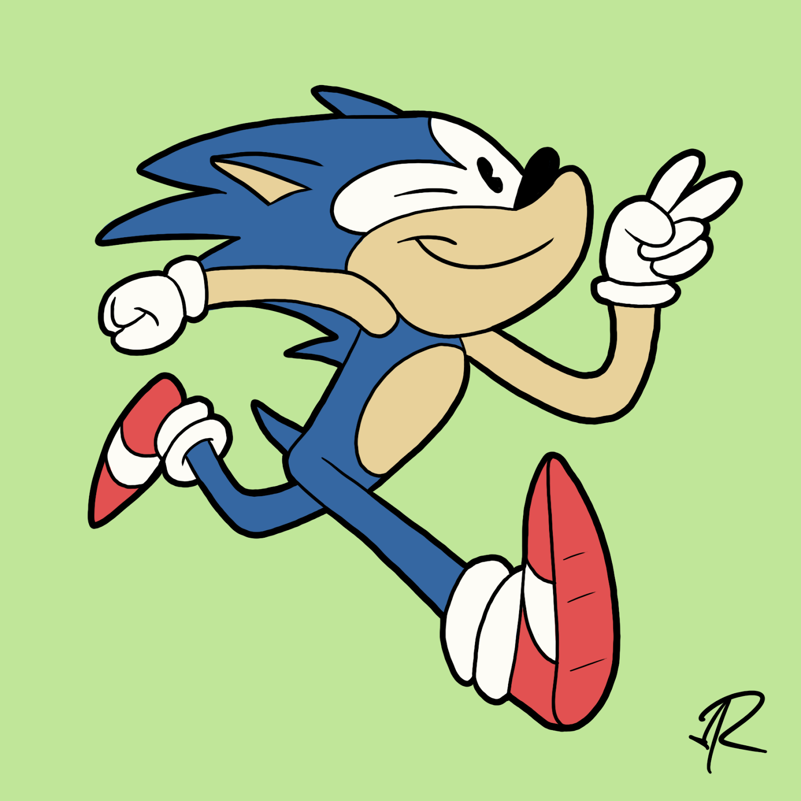
"Sonic"
This theme had so many hilarious contributions.

"Indie Comic Characters"
I did Lis from Bryan Lee O'Malley's Seconds.

"Questionable Fashion Trends"
Decided to draw those 90's windbreakers that I remember seeing all the time and are now faded into obscurity. Referenced some boy band haircuts for this guys hair.
Monday, 7 March 2016
YELL
Sometimes you just got to let off some steam.

Played around with the lasso tool and really digging the style I did for this.
Monday, 28 December 2015
Royal Winter Fair
Some drawings I did from The Royal Winter Fair!
We had to make an illustration based off a drawing we did while we were there. My friend and I wanted to go see the sheep herding event, so we did and we drew. It was also very entertaining and cool to see how the border collies were so well trained to always move the sheep towards the owner.
I found the way the sheep reacted and moved to be humorous. They always looked extremely scared and whenever they moved as a group, they always created this nice flowing composition that directed your attention back towards the dog which is what I did for this illustration. I made sure the bunched up sheep had some sort of flow that pointed back towards the dog.


And the page of extremely rough sketches of the sheep herding event.
Some sketches from The Royal Winter Fair.


Lots of sheep because there weren't much animals out when we went for some weird reason apart from the sheep. Even then, there weren't much sheep out either. I was looking forward to drawing birds but the entire area where they would be was just empty cages. I was sad.
Subscribe to:
Posts (Atom)