Tuesday, 28 August 2012

Business Card

 My friend let me design her business card for some work (Yay! Work!). She does audio related work and wanted a couple of things: the colour red, gold, and sound waves. With her permission and altered contact info, these are the final designs:

The front design.

The back.

I went through a ton of designs and changes along the way with the help of my friend.

This is the first one I made. I did experiment with sound waves, and I struggled to find a good design with them. I decided to go with the audio bars (sorry, the proper name for those escape me at the moment).
I was not satisfied with this one because you couldn't really tell what exactly it was. It looks like cigarettes and I slowly disliked the colour the more I looked at it.

I came across one photo of the audio bars with a red background and yellow lights. It was the colours of what she wanted and it looked more interesting. 
This one was right before the final design. My friend wanted to make the background darker and add a gradient with the yellow lights to this design, which ended up being the final result.

At one point we tried gray...

Back WIP:
I made several designs for the contact info after we settled for the front design. She ended up choosing the first one I made right after finishing the front. But I made a couple as I went along:

 This was for that first design. Helvetica because I couldn't find a decent font to work with what I had.

For the first design as well. This one is a terrible mess with the colours.

These were after the front design was chosen. The bars on the right were there if she wanted, there was a choice in removing it. I didn't like them and my friend also ended up disliking them so we removed them.


 I thought the all caps from the previous one was difficult to read. So I decided to just capitalize the last name only and change the font to something less monotonous. 

And example without the ugly bars. Also fixed the kerning a bit, especially between the letter F and A.

Of course she ended up liking the first one I made right after the front was done. I had a lot of difficulty with the back, trying to somehow connect the front and back together with colour and design (hence why there was optional bars on the right). Even with my abundant collection of business cards, I still find it difficult to design one.

Now time to finish my business card that I've been working on for a while...

Wednesday, 15 August 2012

Team Fortress 2 Posters

So the new TF2 update is today and I thought that I might as well finish a project I started on a week or two ago when I finally got my hands on the Futura Bold font. I wanted to play around with it since I've been looking all over for it, I ended up making this while fooling around:


It's based on a map from TF2 with the iconic RED team's base. It was actually a bit more detailed, but I pushed the simplicity as far as I could go. Following KISS to the extreme definitely made this design stronger. Since I did a RED poster, I thought it was only fitting to do a BLU poster and then decided to make a series out of it because it was fun to do...


Since the payload gamemode centers around BLU pushing a bomb cart to RED's base, it was only appropriate for a BLU poster to be a payload map. I was going to do the map Gold Rush, but the word "Hoodoo" looked much more interesting and hoodoos make some interesting silhouettes. This was the second one I started but the last one I finished due to many changes in the hoodoos and payload cart and attempting to add depth through silhouettes. 


I thought the colour grey was appropriate for Sawmill: the map is raining, it's king of the hill so teams fight for one point, and the annoying two saw blades in the map are obviously grey. I originally made it look like one blade was in the foreground and the other in the background but it looked too chaotic so I simplified it and centered everything since the contested point is at the centre of the map.


Doomsday is a map that involves the teams fighting over a briefcase full of "Australium", a fictional gold like substance so I thought yellow would be appropriate. Along with the rocket having a yellow cap and highlights and it being commandeered by a monkey astronaut named Poopy Joe (the space program's logo is also of a banana).

Wow, TF2 sounds extremely ridiculous when explaining it...

Anyway I might continue this series later on since I do still have some ideas and the big update is supposed to hit today so I may get even more awesome ideas.

Well time to wait for the update, I can't wait to kill an army of robots.

Thursday, 9 August 2012

Smile


I was watching a video and noticed someone wearing a Rocky Horror Picture Show t-shirt, and ever since I saw that movie I always loved the intro with the floating lips.

I originally wanted to create painterly lips floating in black but as I expanded the canvas, there seemed to be too much black. The second lips were originally in a beige background but changed to white at the last minute which made it really stand out. The messy look of the second was a mistake as I was erasing but it captured the fun of smiling so I decided to go with it and it made for some interesting contrast in the painting with simple and messy lips beside each other.

Monday, 30 July 2012

Zoo Doodles

So I went to the zoo for the second time this summer. I'm kind of glad I got some decent drawings this time around, last time wasn't so swell. 


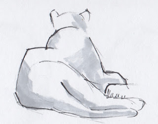
My favourite drawings from the trip. The bear kept pacing back and forth the entire time we were there, I have no idea why. It was difficult to draw the bear while he/she was moving. Since the hippos did not get out of the water after we waited a while, we drew the pygmy hippos instead.

Also, I drew rocks while we waited to see if the hippos would leave the water. But they didn't.


Thursday, 26 July 2012

Fantasy and Fairy Tales

"GeoMossCaveThing.jpeg"
Just something I painted along the way, hence the name of the file (geo=geometric). I wanted to do something green and thought of some primitive human tribe's cave or something along the way.

My elective first year was Fantasy and Fairy Tales and we had an assignment to write our own fairy tale (the only assignment I did well on...). I remembered the one I wrote, titled "The Golden Tree", and decided to attempt to create what I had in mind. It changed as I was working on it from being set in daylight just like in the story, and thought that the tree in the dark would be more interesting by being it's own light source.
I'll definitely come back to my fairy tale's setting in the future and probably re-draw this.

What did I learn from all this? I need to get better at trees/leaves.

Saturday, 21 July 2012

I decided to paint a couple of objects that were in my tin can/pencil holder. I was originally just doing the handles of my scissors, but I wanted to try some more hence the awkward composition. But I think the scissors and pencils and pens turned out nice. Although the knife was a bit too tricky for me, I seem to be getting the hang of digital painting now.


Friday, 13 July 2012

New Banner

Ditched the Bread Crumbs title card for my comic and decided to make a more personal banner. So the title for this blog is now "Art of Marco Rivera". Putting my entire name seemed too cluttered, and I thought a little abbreviation made it look better with the single highlighted letter. Also "Marco Rivera" is such a common name, the abbreviation seemed appropriate to differentiate myself from the countless other "Marco Rivera"s.


I also somewhat changed my blog's colour scheme to match. I made sure to make the backgrounds a tad darker and restricted to greys so that any colour and whites and blacks stand out. I couldn't choose between a light grey (matching my banner) or a darker grey for the main background, so I went for something in-between. I might tweak it a little more, there's something off about it.

I know it's not much and I'm pretty much working with Blogger's template, but a complete overhaul will come soon enough...just seeing what I can work with at the moment.

UPDATE:
I ALSO LABELED ALL OF MY PREVIOUS POSTS. YAY!!