Sunday, 2 December 2012

ZOMBIES!

Everything seems to have zombies nowadays.

I finished the last episode of The Walking Dead Video Game by TellTale Games yesterday and I'm left with wanting more. One of the best writing and character development in a game I've played so far, and never have I had such well crafted choices to choose from without a "good" or "bad" side.

With the finale of The Walking Dead Video Game, the mid-season finale of The Walking Dead tonight, my brother constantly playing zombies in Black Ops 2, and after playing a couple of games on Left 4 Dead 2 last night (after craving a bit more zombies), I drew a zombie during a club meeting this past wednesday and finished it after playing TWD:VG by making it into a horde of zombies.

Why? Because everything has zombies nowadays, even my sketchbook.


Metamorphosis

This assignment was pretty fun to do! We had to take an existing pose that we drew this year and change it in 3 drawings. Either a progression of a change, 3 separate changes, or 1 change with different techniques.

I decided to try out what they do in second year animation where they do a creature design while life drawing. I had some people even say it reminds them of the animation assignment when I never told them what my goal was. YAY!

My pose involved holding a pole, so I had to design a weapon or tool as well as think of what kind of setting they would be in.

I wanted to do something with hooves. So I was inspired by a satyr from Greek mythology. I put him in front of some temple as though he were guarding it while conjuring a flame.

I also wanted to do a bug. This one required a lot more research but mostly based off a praying mantis' features. This one is probably my favourite. I gave him a hand crafted stick and put him in some fantastic forest as though he were travelling or just entered a brawl with someone in the forest.

I had no idea what to do for my third one and the only thing I could think of was a bird but I didn't want to draw a ton of feathers. Plus, what does an anthropomorphic bird hold as a weapon? And what setting would he be in? I chose a rooster because of their interesting silhouette (and the fact that I'm quite familiar with a rooster's features) especially around their legs and head, and they have very thin feathers. I also looked at other birds such as flamingos for more reference. I gave it a spear because I didn't know what kind of weapon a rooster would use, and gave it context by putting him in some sort of dojo as though he were training.

***
I also have previous assignments that I need to take a pic/upload but there's too much work right now nearing the end of the semester, plus portfolio. I probably wont be able to update in a while, but I may upload a little something after this one. 

Friday, 16 November 2012

Workshop: Expressions and Caricature

Expressions

So I've been forgetting to post my drawings from our workshop that we had where we learned how to capture expressions.

SO HERE THEY ARE AFTER A BIT OF A DELAY:

This was the first one we did, each pose was 10 minutes each. The subsequent 2 drawings didn't turn out so well.

This was the last one we did. Everyone kept describing it as "sinister" and "it looks like she's about to kill someone". I'm glad my last one turned out well!


Caricatures

This week we did caricatures. I never really took the time to try and learn how to do one, so the day before workshop during extra life I made an attempt: 

I thought the regular drawing looked too feminine so I stopped and decided to give exaggeration a try. Since the model had such a slender figure, I tried to emphasize it. 

Then another drawing didn't go too well, so I tried drawing his face instead. The drawing on the right was a quick attempt at redrawing the pose but I gave up and did the caricature instead, it still looked pretty cool on the page so I left it.

This was the last one we did in workshop. The first couple of tries were not going so well. It was difficult but I pushed myself to get at least one decent caricature during workshop, and it turned out waaaay better than I had hoped.

Thursday, 8 November 2012

Society Of Fine Artists

So I recently joined a club barely knowing what it was about. As I snuck into another painting class to see what they were doing for their collaborative painting, a person in that class mentioned the group to me and said they were having a meeting the next day. I decided to check it out because it sounded interesting. I won't delve into the details but the group aims to create artwork for outside organizations and ourselves, as well as finding ways to raise even more money for the VCA Art Show. And a couple other stuff.

During the first meeting we needed to design a logo for ourselves. So we decided that we all design one and show each other then pick the best one. They picked mine as the official logo for the group, to be used for letterheads, business cards and more professional stuff. We also melded two designs together to create another logo for a poster board for the club fair that happened yesterday.

Anyway here's my design:
I looked at existing logos for galleries, art museums and other art organizations for inspiration. I noticed that a good number of them had bold white text on a black or coloured background so I worked with that, but I also made sure that the design worked without the black background. So either of these are interchangeable depending on when and where it's used. 

 We also thought it would be cool to have some symbol that represented us and is able to be recognized like some sort of secret symbol that only we understood. So I tried my hand at making one:
The guy in charge liked this one but one person didn't get the design, and they also pasted this on the poster board upside down. It's supposed to be a pencil drawing a line and I honestly think it needs more tweaking due to the two problems. Especially on the pencil but he already took it as it is.
I also wanted to design this so that the colour can be changed, either for events, celebrations, anything of the sorts. So here's an example of it in different colours.

Thursday, 1 November 2012

Collaborative Painting

For painting this monday we did a collaborative piece. I thought at first that it wouldn't be fun and it didn't really accomplish much but as we got into it, it wasn't as bad as I thought it was. In fact, it was a bit enjoyable.

We started off with a theme which was "Evil" because some people wanted it somewhat related to Hallowe'en. Then there were instructions on the board, 3 of which were more technical oriented (make # [shape], make red line, glaze with blue etc.) while 4 other instructions were more abstract ideas (paint something delicious, forest, blind, disease etc.) that we had to incorporate into the piece while replacing it with another instruction.


It was pretty interesting. The woman's body on the top left started out from "two ovals" and someone painted boobs. Then someone made the body from the word "prisoner" and near the end when we contributed whatever we wanted to the piece, someone added the cutting markers and I added the pink handprints on the boobs.

It definitely was interesting, how some parts evolved like the woman's body, while others remained the same. Making the entire piece balanced for ours was difficult since there was too much white, so they glazed it with orange and we were each told to add some more black to it. It was also fascinating to see how the more that was added, people started to consider the entire composition.

My teacher titled it, "Sinner Dinner" since you can read it both ways. I would like to point out that I sabotaged the S and made it into a D because I thought how silly and easy it was to alter it into a different and unrelated word.

Sunday, 28 October 2012

Life Drawing + Collage Assignment

30's


This one is probably less than 30, I fooled around with my friend but I liked the look of the lines I made.

1's


I really liked the model's short poses. All of these 1's are from the same model, she has so much fun when posing.


2

3's


I seem to be in love with this drawing the most out of this bunch. I don't know why, I just find it the most interesting thing to look at.

5's


10
THIS WAS SO HARD TO DO. I didn't feel like moving places when this happened, so I thought I'd give myself a challenge and try it out. It didn't turn out as bad as I thought it would!

15
15's and I have a love and hate relationship. They're good, but I just can't bring myself to keep working on it after 10 minutes. I hesitate a bit thinking, "should I add more detail? No, I don't have time!" when actually I do. Or, "I'm rendering this part too much, do I have time to finish the rest?!"

Collage

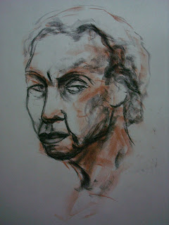
Unfortunately I didn't take a picture of my ink assignments that were due last week. But here's the assignment before that one which was to create a self-portrait and figure study using greys, blacks, and white paper. 
I disliked this project immensely. I understand the purpose and I can see what the assignment was trying to teach us, which is blocking out the different values. It was just too bizarre of an assignment and it was waaaaaaay out of my comfort zone.
So why am I posting them? Because I might as well, I think my portrait turned out decently. Heck, even my camera recognized it as a face! Also my teacher took both of them and are going to be displayed in the hallways (well, I couldn't find it in the pile and she says if it wasn't there she's using them).


Thursday, 25 October 2012

Poker Hands

For my 3D class we had to do a sculpture in plaster. A large majority of people seemed to be doing hands because it was the most accessible and manageable thing to work with, but I didn't want my piece to seem like every other person's piece that used hands.
I had no clue what to do yet even after creating one hand but an awesome idea came into my head one morning that made use of the hand that I already created: hands playing a card game. I wanted to do something with cards, such as hands shuffling or performing a magic trick, but I wanted to make use of the 3D space and how a sculpture is usually viewed in multiple angles. So with mine there are 3 ways to see it:
- The poker game in progress
- Player 1's perspective
- Player 2's perspective
Which is the reason why the hands end at the wrists, so it's as though the viewer takes the role of the player that they're looking at (thank you FPS games, you gave me inspiration).

Also this year they've been lecturing us about installation in most of our classes, so I wanted to be creative with that as well.

Anyway here it is:


As I was setting up my area a classmate of mine suggested the jackets on the chairs and even helped me set up a more intense game than what I had since my knowledge of poker is very very minimal. During critique it was suggested that I put it in the end of the year show (YAY!) with some changes such as:  green felt on the table, preferably a card table (I originally intended for this but didn't have one), black and red jackets on the chairs (to match the colours of the cards),  and poker chips (I was going to do this but I couldn't find any cheap poker chips since I didn't want to waste my money on something I would never use). I will definitely make the presentation much better at the end of the year show, which I'm still pretty nervous about.

Progress photos:

We had to cover whatever we were going to cast in wax first. Unfortunately no photos of my hand covered in wax because my other hand was covered in vaseline (which we needed to apply before the wax). Here's the wax mold filled with plaster already.

Then when the plaster had hardened, you take off the wax and voila! Any holes had to be filled some plaster then I sanded it down.