Tuesday, 24 January 2012

Hands and Feet

Life drawing assignment that was due today was to draw 5 hands and 3 feet. I spent one whole day drawing hands that were horrible. The day after, I was on a role. In the end, they turned out pretty badass and I am very pleased with the results. Although, I could use more work on them though, especially the wrist area.
Thank you Leyendecker and hand studies throughout the summer, you helped a ton.

I love these ones. The wrist on the top one is sort of wrong, it's bothering me now.

Least favourite on the top left, most people seemed to like it for some reason...

My favourite.

Second favourite.

Feet. I never drew them before, so it's not that well done. But it took less tries to get a decent foot drawing than a hand.

This was really good practice before I draw the hand drawings for portfolio. It's creeping up ever so slowly.

Thursday, 19 January 2012

Sketchbook Dump

Did some hand studies and decided to give 1 minute hand gestures a try. Decided to do it in pen to get comfortable with it. I tend to be a nervous when using pen. Top right and bottom left are my favs.

I was working on my character, I went off on a tangent with this one. I thought it was a pretty solid drawing, so I saved it.

Unfinished bear/sage character. I might come back to this one day.

Creeping in the cafeteria...

 ...and my 3D class.

I just did this an hour ago out of boredom, and my moleskine needed some colour. She was going to wear a dress but I said, "nah" and decided on a bath robe instead. Why? Well, why not?

1st Semester Finals

Heyo! I know I haven't posted here in a while, I'm awful like that. It was mostly due to the fact that I had nothing to post. I forgot most of my 1st semester stuff at school during break, and even right now I still don't have some of the stuff. But I have most of them so here are the ones that I have:

Painting
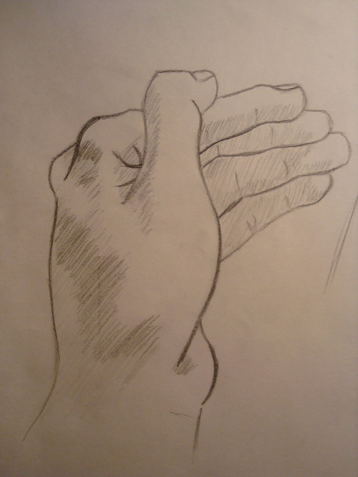
For our painting final we had to create a scene based on the very very little story details we were given. The story involved some sort of kidnap, people talking, a barn and "The Monkey", which was pretty ambiguous. I imagined it as some sort of interrogation scene, with someone who possessed an important monkey necklace. Most people made "The Monkey" as a person with a possible tattoo of a monkey, since the narrator of the story thought it was a person as well, but it never really stated it was a human.
This isn't the painting, but the drawing I did. I preferred it over the final painting. The painting was okay, but I disliked the face so much, although the body turned out well. Unfortunately the painting is at school, I have no clue where it is.

Remember that egg tempera painting we had to do? I finally got it back so here it is in it's awful, messy, eye butchering state. I dislike egg tempera, although I found it as a fun process. Creating the board we painted on, and the process of mixing pigments and such made me feel like an alchemist of sorts. I still hate egg tempera.

 2D
We had to create a ransom note while "thinking as designers". Mine was the teacher's favourite because it stood out from the rest. It didn't follow the whole "Gimme ___ or else ___" style. The message was clear and the threat was implied and clearly understood. Plus the "Braaaaains" gave it a natural voice/some personality. I love the poked out eyes the most. 


3D
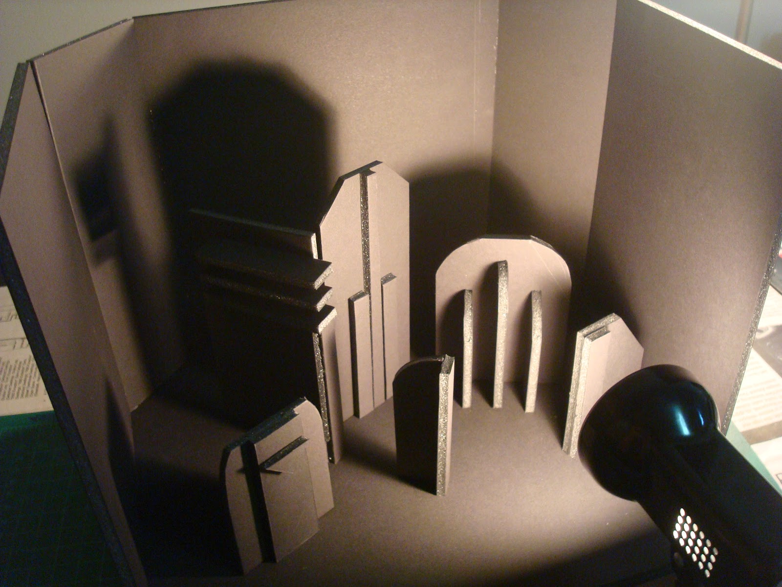
Our final sculpture had to use light in some way. I went with an interactive sculpture. I literally had no clue what to do for the project until the night before which resulted in a lack of sleep and a horrible night that involved my light source's lightbulb breaking in the process and freaking out. All was well in the end.

I decided to focus on shadows light creates more than the light itself. So I created abstract shapes on a platform where the light source can be moved to create interesting shadows on a background. This was before the background, I thought it looked sweet.

I decided to go for an art deco design for the structures, or "buildings", because art deco has very sharp and geometric silhouettes and shaped with repeated lines. I thought it would fit very well for my idea. Plus, I absolutely love art deco.

I had to place each structure in a specific area and angle so that some shadows didn't cover an entire building, and the shadows needed to look interesting in different angles. The angled placements of the buildings got a thumbs up from someone and the teacher.

 Here's a shift of the light source from one side to the other. The lightbulb was fixed on a small platform in between two pieces of foamcore. The platform was able to move left and right.


I really liked the idea I had, and I thought I got my idea across. Although, I think I could have done it in some better way.

-----------------------------------

Unfortunately my life drawings are still at school because I've been lazy to pick them up. I will soon, and I shall post them...well one of them. The other didn't turn out so well.

I will also post some sketchbook stuff in a bit.

Thursday, 15 December 2011

The Fausyberries and Splee Variety Show

I've been busy with final projects and such, I'll post all about that soon. Unfortunately I do not have pictures of most of my finals, but I'll see what I can do.

In the meantime here's my final project for Digital Media class. We were supposed to do a print design of anything of our choosing. But if we were doing a design for a recognizable brand, company, group etc. we had to get their permission. So it was recommended that we use smaller organizations than larger ones. A friend of mine asked me to do a poster for her radio show, but I unfortunately did not have the time then. To pay her back I got permission from her to do it as my final project! Yay!

Here are 2 versions I made: one 11x17 and the other 8.5x11. I did not know we had to hand in an 8.5x11 while I was working on the 11x17 because I thought of a poster, hence why it looks squished in the 8.5x11.

fausyberries&splee

11x17 version

Fausyberries&Splee

8.5x11 version

I'm very proud of the logo for the show, it turned out better than I expected. I also tried to incorporate her school's colours in the poster, but their colours didn't look that well when there was too much of the yellow on the page. So I kept it only for the important texts such as the title and the schedule to make it stand out.
I wanted it to be a simple graphic poster, but the requirements needed at least one bitmap image and I'm pretty sure the tiny icons at the bottom wouldn't have been sufficient enough to satisfy that requirement. That had me stumped for a while and I couldn't find a good picture of a microphone or a radio, nor did I know how I would incorporate it into the design. Luckily I thought of a pretty decent idea and it turned out okay. I still wish I didn't have to put one in the design though.

Anyway, my last class is tomorrow and then it's Christmas Break! Too bad I'll be spending most of my time working on portfolio work/doing studies. Yay for no rest!
Also, my schedule for next semester is somewhat okay, but it's pretty hectic. At least I got mondays and thursdays off.

Sunday, 27 November 2011

The Origin of O'ren Ishii

For painting we started oil last week. First thing we did was still lives, mine turned out pretty well but that's at school at the moment. For homework we had to take any scene from a movie and paint it. I asked if we could do videogames and my teacher said it was fine as long as it wasn't cartoony or anything with a unique visual style (I'm assuming this applied to movies as well).

At first I was going to do Half-Life 2's plaza during the intro, then I just scrapped the whole idea. I decided to think of a film that I absolutely adore that also had great composition and was visually appealing. I thought of any Wes Anderson film due to his prominent use of primary colours and 1 point perspective/symmetrical shots, more precisely The Royal Tenenbaums. 


Then I thought of the director I absolutely adore: Quentin Tarantino. I first thought of doing something from Inglourious Basterds, but there's that whole Nazi motif that I knew some would get offended. Then there was that dancing scene from Pulp Fiction. But I settled for my most favourite film by QT, Kill Bill. I went with the fight scene with O'ren Ishii in Kill Bill vol. 1, Chapter 5: Showdown at House of Blue Leaves; that scene had tons of beautiful shots it was difficult to choose. Anyway, here are the WIP pics and final:


The final.

Close-up of O'ren.

I'm very proud of it. Sure I can see the many faults in the painting, but I achieved so much of what I wanted I'm proud. I'm proud of the face, except her right eye. And I absolutely love how her left hand turned out it's perfect. I had Leyendecker paintings at the side to reference and it really helped a lot while doing this painting especially the hand. I didn't want to paint it exactly like it is in the film, because then I would have been scrutinizing over it all day. So I looked at the original and just referenced it, but drew it on my own and with a little bit of Leyendecker style. 

Let's just say, where have you been all my life oil paints?

Saturday, 19 November 2011

SUPER AWESOME MEGA POST FOR ALL MY CLASSES (excluding Art History)

This past week was really busy, but I got through it. I'll go through each class in order since i had something due.

Painting

I honestly thought I took pictures of my egg tempera painting. Turns out, I didn't. I shall post a picture as soon as I get it back. In the meantime here's one of two boards we made to practice egg tempera on. I'll explain more next time and my opinions about egg tempera.

Although it was just to play around with egg tempera, I started to enjoy doodling on the board. I even began to balance out the composition and colour throughout; I was in the zone. I have to say that I like it, and it is probably my first abstract piece. 

Life Drawing

This one, along with another, was the one I handed in for those gestures. I'm not posting the other one because it's not that well done compared to this one and the one I posted last time. I handed it in because it had a face which my teacher seems to want unlike the previous one.

This project was pretty cool. I was nervous to start it, scared that I might mess up. Unfortunately I did.  3/5 of those drawings are great. After I drew the biggest one, I barely had any space hence why there's that awful looking one next to it. But my favourite has to the the far left one.

We also handed in our sketchbook with 10 drawings of interiors with minimum 5 people. Since that's a lot of drawings, I'll save those for another post.

2D

For 2D we had to design a billboard that was for a political issue. My first idea was the perfect one, everything I thought of after that was mediocre. Compared to the roughs we presented the week before, the text was the only thing that changed, I just added some space between each character.

Marco River a Billboard

I would just like to add, for critique, the class placed the billboards from the strongest to the weakest design. Mine was put first. I'm very proud of how it turned out and I'm glad that everyone loved it.

Also, for this week we learned about type contrast and did a quick in-class activity using random words given to us. We weren't supposed to understand them so that we can focus on the different kinds of type contrast.
Marco River A Contrasts
Second page here ^

3D


For 3D we take something from nature and use aspects of its features to create a container. I brainstormed ideas from turtle shell patterns to create a bowl, to galaxies and comets as another bowl and ashtray. I settled for a tornado-vase-ish thing. My initial ideas had very elegant curves, as I started to go for something geometric my teacher helped improve my idea. Here's what I ended up with:


Made out of foamcore, it consists of 28 squares. A lot of people liked it when we did critique my teacher loved the design choices I made along the way like beating up the edges and crumpling them up to give it a rough look which conveyed the destructive nature of tornadoes. It was meant to be taller and the sides originally went out more. But balance was an issue so the direction it points out aren't as exaggerated. Overall, I'm satisfied with it and I'm glad it turned out better than I thought it would. Here are some WIP pics.


Digital Media


For digital media we started Illustrator and had to either create a map of our school but put a unique twist on it, or a cross section diagram of anything. Most people had regular maps but for different situations. One person had a map about perfect places to go during a zombie apocalypse, another had the best places to sleep in Sheridan. For mine, I decided to go for an old style, Middle-Earth-esque map.
Kingdom of Sheridan
Let's just say I outdid myself and exceeded expectations. It turned out better than I had imagined. Each tree was individually drawn, unfortunately with a mouse. I wish I had a tablet, it hurt my hand afterwards. Once again, during critique, people were amazed and so was my awesome nerd of a teacher. The only issue was some words overlapped some lines (A wing & AA wing) which made it slightly difficult to read, but that was just a minor problem. My map contradicted most of the advice he gave to others, but because of my design it was acceptable (ex. Angled words). I got a ton of compliments and at the end my teacher said, "Other than that I have nothing else to say on how you can improve." Apparently I was the first person to do a map like this. I loved how it turned out so well, I printed two copies. One to hand in, the other for myself.

Sketchbook 

A friend of mine had a cartoon tiger he showed me that was in a frontal view, I told him it was flat looking. Without telling him, I started to draw his character in 3/4 view with my own style. Hilarity ensued. The drawing turned out pretty awesome though.

My attempt at a head rotation for my character. Still early, and the front needs a fixing. The back is currently uninteresting, hence why I didn't draw it. I just need to add something more to his head. Maybe hair?

Bored the other night and had the idea of a bird with features that vaguely resembled tribal headgear. The wing area gets a little flat looking, but I had fun drawing entirely from my imagination. It was also to play around with some shapes I found interesting.

Well, that was a lot to go through. I'll try to update soon to avoid another "SUPER AWESOME MEGA POST".

Sunday, 6 November 2011

Digital Media

The biggest project to hand in this past week was an interpretive self-portrait created on photoshop for Digital Media.

We took photos of ourselves any way we wanted and we had to photoshop it into an image that told something about ourselves. Here's my original photo:


The requirements were only to mask it and photoshop at least 3 different things. Me being bored and wanted to go over-the-top with this assignment created this:


It was very difficult to find a good background that allowed me to place my cut-at-the-waist image, yeah the worst place to cut a person off in a picture. This project was actually difficult to do, finding resources were a lot harder than I thought. Not to mention the disturbing images I had to get past when searching terms such as "headshot", "blood spray", and "shot soldier". 
My portrait is is supposed to convey my love of videogames. I never though my Team Fortress 2 screenshots would have came in handy for the combat log. Other videogame related assets are the medic call bubble also from TF2, Nintendo light gun I'm holding, the headshot blood splatter is from a Fallout 3 V.A.T.S screenshot and the nametags are reminiscent of WoW's nametags. I also threw in my "internet persona" name "Bluko" in there as an easter egg for the guy being shot.

Life Drawing

We handed in 3 drawings this week, but I do not have photos of those. When I get them back (probably tomorrow) I shall post them. It was an awesome activity, so I enjoyed doing that project. Here are some extra life stuff.

I really like the face for this one. The proportions are slightly off, but I like how I got the slight twist in her body.

This is an example of one of the things we had to hand in. Using a darker colour we had to create a blocked out version of the figure, then draw in the rest very quickly. I absolutely love this kind of gesture, and this one turned out very well. Unfortunately I didn't hand this one in because I thought the teacher would prefer a picture with a face instead. I had a ton done like this, and it was very hard to choose two to hand in.


Some gestures that I like.


1 minute drawings that turned out well. I absolutely love the bottom three on the above photo.

I like how this has an unfinished look to it.

I'm pretty sure this was near the end of extra life so I started to get tired and only draw parts of the body. This one turned out pretty good.

Sketchbook

Doodled a bit yesterday and I created this awesome face that I'm very proud of so I thought I'd share. 

This view needs a little tweaking, the eyebrow needs to be a little lower but overall I like it. Character perhaps? We'll see, I've been making faces since the beginning of October and 3 turned out pretty well, this one being an altered version of the second one.