Monday, 30 April 2012

2D

Group Beverage Label

Credit also to Leroy S. and Sarah L.

The project was to design a label and logo for a fictional beverage company. Our group chose to do a wine and the idea for a space constellation was met with approval. It was fun and somewhat challenging when working with a group to create a design, but the final result turned out great. I love how the logo turned out.
Main Logo
Main Logo variant
Wine Logos depending on the flavour
Rose
 White
 Red
On a wine bottle


Orion White Label
Neck designs
Back label

Innovators+Ideas

Needed to create a poster for this event, a lesson on heirarchy of type. Only one font family was allowed.


Self-Portrait

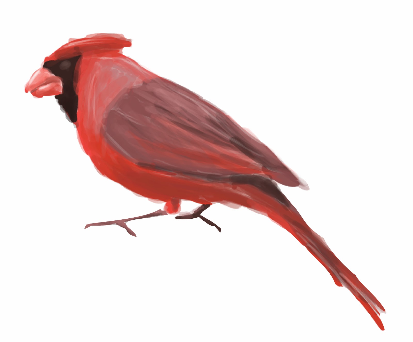
We had to do a self-portrait with about 15 things about ourselves. I dislike self-portraits because I have to keep looking at myself for long periods of time and noticing tiny faults. Anyway, I did a The Saturday Evening Post style cover of me drawing a bird. I dislike how painted-me looked, so here's sans me and just the bird because I'm proud of how that digitally painted bird turned out. 

Layout

(Note: it was me standing while holding a sketchbook/drawing and looking at the cardinal.)

Cardinal
CD Project

We were given a list of artists with one of their albums and we had to recreate the CD. I chose to do Caro Emerald due to my obsession with the era she emulates in her music (40's/50's jazz). I never heard of her before but since I listen to that kind of music anyway, I was very familiar with the themes that were common in that style. My teacher recommended me to do a Saul Bass type of style which he seemed to think I nailed in this project. Got a high mark even though I got a 0 on one portion, so yeah he must of loved it.
Cover/Insert cover & back
 Insert 1
 Insert 2
 CD tray/spines
Afterwards we needed to assemble it into an actual CD case:

Don't mind the crack, I just used an old CD case.

Back with one of the spines.

Opened insert, we only had to use one of the insert pages. Also, I didn't bother trimming it...

Thursday, 5 April 2012

Portfolio


Well...I didn't get in this year, I found out last friday afternoon. I guess there's always next year...*sigh*. Anyway, here are the apparently bad work I did, except for the the character design because I don't like it and my storyboards. The only thing I got good scores on were my layouts with a couple 4s and my hands.

Here we go!

Life Drawing

(10 min)

 This one was the last drawing I chose to put in, I wasn't even sure to add it. But after showing a couple of people my portfolio, they all seemed to like this ball holding man. (3 min)

(5 min)

Animal Drawings

Doberman

Doe

Hand Drawings

I did well on these, I guess those countless Leyendecker studies during the summer and constantly drawing hands whenever I had nothing else to draw came in...how should I put this...handy! (Note: this pun was unintended and I noticed it last minute so I edited it).


Character Expressions

Okay, I'll post the expressions. That was the only thing that I liked from my character. Especially the surprised look.

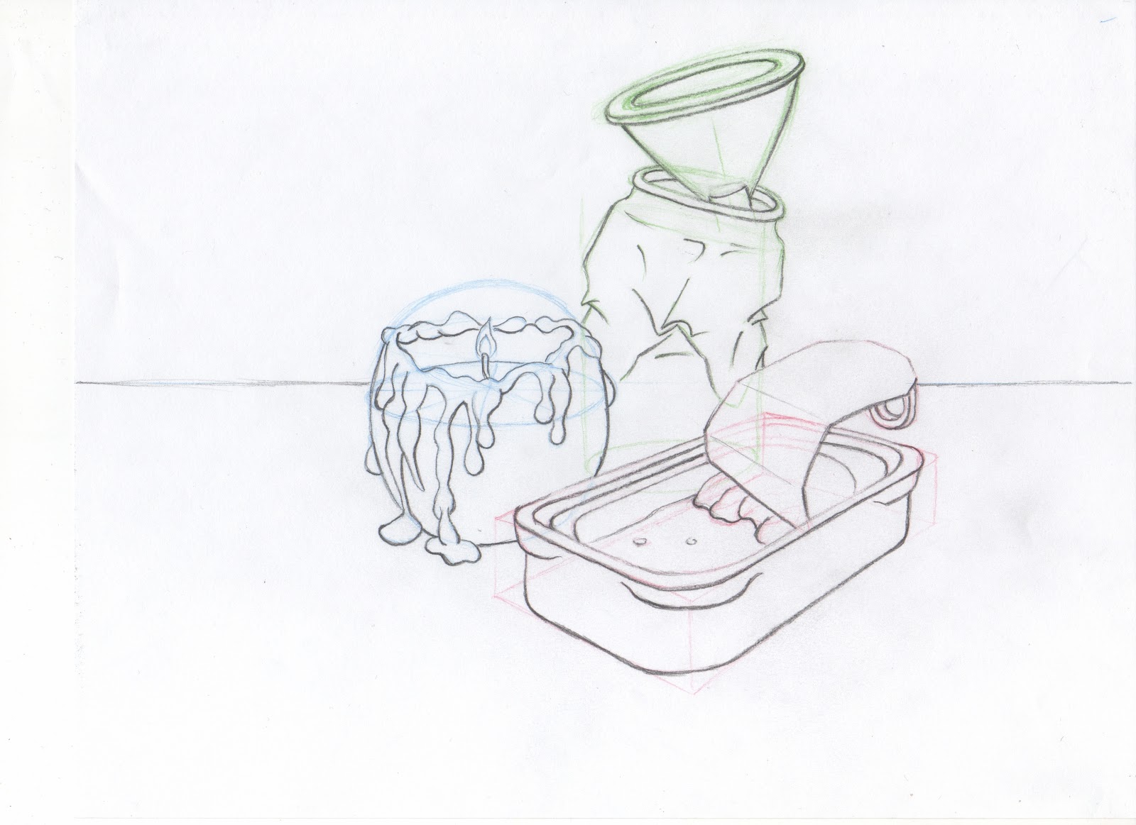
Object Drawings


Room Drawings


In the end I'm kind of happy I got at least some 4s (one for the object and another for the room [and most people didn't do so well in the layout portion]). But I think I deserved some better marks in other areas. Well there's an entire year for improvement, and I'm super excited about that. I've already started doing some studying again, starting all the way at the beginning by practicing with lines and basic shapes (boxes, cylinders etc.).

I'll be posting what I've been up to during classes this past month in the next couple of days or so. Although some of which I don't know if I'll be able to post, such as my digital projects. Although I might be able to post my mock-up website for a wine.

Sunday, 4 March 2012

Portfolio: Personal Work

So portfolio was last week, I handed mine in the first day. I'll have to wait until the end of the month until I get the results. I'm very proud of the work I produced for the portfolio (except the character design), although I'm hesitant to post it online right now.

I will post my personal pieces I attached for the "personal work" section though. One of my personal pieces was the hand drawings I had to do for Life Drawing, so I won't be reposting those.

Skeleton Study


I know I messed up on the pelvis, that was difficult to do along with the overlapping arm. As well as the foreshortening of the left leg was difficult.

Standing and Sitting Figures


This one I am VERY proud of. I've received a ton of compliments for it too, even from the model himself! The task was to draw the same model in both standing and sitting (clothed) poses. Drawing on kraft paper with the highlights, shadows and mid-tones were optional, since we had to do a drawing on kraft paper anyway. The kraft paper drawing I will post another time.

Rooster Head Sculpture


This took about 7 weeks to create, and we also had to create a sketchbook with studies on the animals we were doing. I may or may not post those notes, but I have some decent drawings of roosters in there. We also had to create texture on the sculpture. I had difficulty finding something similar to the bumpy look of the wattle. I went through several textures until I settled on using the towels used to cover the sculptures and keep them moist.

Moleskine

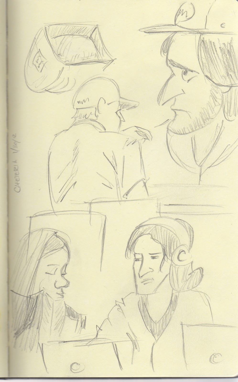
I'm only posting the best interesting pages. I've already posted one page not too long ago.


I like this page. I've had the idea of doing cardinal heads, but only showing the black pattern on their face on a red background. I tried that, but it didn't turn out so well. A watercolour background, red pencil crayon and marker got the job done. I also have a raccoon page similar to this I'm working on.


That's all for now. I'll post most of my portfolio soon, something about doing so now just makes me feel uneasy.

Monday, 6 February 2012

Digital Design + bonus life drawing

Digital Media

Our first project for my Digital Media class was to create a catalogue spread/insert for the company, TheTateGroup. My teacher said that they were looking for a design for 2013, and if they found a good one created by one of us, they may even choose it and allow someone to work with them.

Anyway, the company is about selling products ranging from cool rollable water bottles to potpourri for poop/the bathroom (poo-pourri). Their previous catalogues were a mess and they didn't seem to have an image for themselves. So I decided, with my design, to give them a more modern look with a slight hint of retro design.

Here are the back and front:


And the inside:


I'm pretty proud of the design, and I even got a ton of compliments for it!

Business

For my business class we had to make a resume and cover letter for an art related job posting. Part of the project was to create a logo for ourselves to put onto the cover letter and resume.

So here's mine:
I originally had it as a stylized banner that folded behind with triangular ends, but I thought they were distracting so I removed them. It's quite obvious I looked into art deco/old logo designs here. 

Life Drawing

I finally brought home one of the final assignments from life drawing last year. It was to draw the anatomy of the pose:
Don't mind the head...that's a terrible head. The proportion and perspective of it is wrong. Other than that, I think it looks somewhat fine. I could use some work on the abdomen.

******
It's portfolio crunch time, so I will most likely go on hiatus until reading week. Most of my projects now aren't even due until that final week, so I won't have that much to post anyway. Probably some of my work in progress for my sculpture assignment. Other than that, I think other work can wait to be posted until after. 

Wish me luck.