Saturday, 21 June 2014

Acting for Animators

Back from a brief hiatus. 

During the month of May and the first few weeks of June I took Nancy Beiman's Acting for Animators workshop. It had an odd schedule at first with 2 classes per week, then once for one week, then the rest was 3 days a week hence the lack of posts. 

It was an interesting class where we watched many videos from animated movies, live action films and a ton of silent films and early talkies. I heard the name Laurel and Hardy before but I never really knew who they were. After watching a number of their films, I have grown to enjoy their films quite a lot! Consider me a fan of their work!

Through the class I learned about the importance of timing and how it affects acting. We looked at the likes of Chaplain vs. Laurel and Hardy and the differences in their timing and how they're different in humour due to their timing. I also learned the difference between acting and just making something move. I learned a few other things such as charting and exposure sheet protocol as well as a workflow that makes making animations much more easier. We also got some neat handouts that are an interesting read regarding acting as well as animation principles. 

It was also pretty nifty to hear some anecdotes from Nancy about things in the animation industry, her time at CalArts and people she met there who are big names in the industry today, as well as just some interesting little stories that didn't involve animation.

But the class wasn't just all movies and talking (although most of it was), we had two assignments. 

One was to take her neutral character she gave us, Seti, and animate it showing either a sense of pride or shame. The idea I had involved a transition from being proud to being ashamed. The initial idea had the same actions in the final but Seti was facing to the right the entire time. Nancy decided a simple head turn to the left for most of the animation gave it a lot more acting, context as well as personality and it really did turn out better than the first pass:


The second assignment was to take 2 inanimate objects and give it distinct personalities and make them interact. I originally chose a broccoli and carrot dancing but at the last minute thought of a carrot acting as a matador, which my instructor thought was far more interesting. So I made the bull a potato and added the sprouts to be like horns for it. This assignment made me realize the importance of acting since these are just objects without any life at all; I couldn't make the potato look vaguely like a bull, but rather I had to make the potato be a bull through animation:


Some other drawings done during the class:

We had I think 1 min (I think?) to create a pose showing pride with a prop.


The above 2 are a series of drawings to show pride (top) and ashamed (bottom) with a prop.

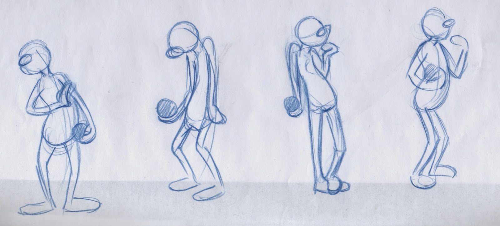
Early thumbnails with the broccoli idea. Then some early thumbs of the carrot matador.

A few thumbnails of the carrot matador before starting it.

Sunday, 4 May 2014

Techwear Monkey

I did an art trade with Bernard Malijan III. He requested for a monkey (WITHOUT a tail) wearing techwear. I did my best to understand techwear, from what Bernard told me it was like an urban ninja style but the clothes transform sometimes, such as into a bag.

Some of it looks pretty cool and at other times it looks ridiculous with gigantic collars. Regardless, the style was pretty fresh to me and provided me with some new references for the future!

Since it is a trade I got an awesome greaser version of myself with a pet platypus in return. Anyway here's my techwear monkey:


Thursday, 24 April 2014

Demo Reel Year 1

YEAR ONE COMPLETE

PHEW. That was exhausting.

Here's my demo reel/a look back at some of the work I did in first year:


It's been one week since I finished school and I already miss it so very much, I want September to arrive already!

 What I enjoyed the most of my first year was the people. They made me enjoy every day at school and made me want to go there nearly every single day. With summer break here there's been people that returned to their respective provinces and countries and it was a pretty sad to go to school the other day to clean out my locker and not see people in the studios. Familiar faces you expect to see right around the corner/station weren't there and it was somewhat crushing.

It's only been a week and I already can't bear this 4 month long hiatus, this will be a very long summer and I'm actually not looking forward to it.

Apart from that I enjoyed year 1 immensely. It was everything that I hoped it would be and much much more. I enjoyed all the classes even ones that I didn't like much (electives don't count) because it was always animation related anyway! There were several instances in the middle of any class where I realize, "Geez, I'm drawing cartoons for school. This is going to be my career." It's literally a dream come true. It was such a surreal feeling to experience, learn and apply knowledge gained from the entertainment that I grew up on.

I HAD CLASSES WHERE WE ANALYZED THE LION KING.

Anyone that knows me knows how much of a big deal that is, it's my all time favourite film and to watch it and learn from it is something from my dreams.

Overall I enjoyed it and I most definitely improved A LOT in drawing and I'm proud to be where I'm at skill-wise, even though I'm known for not being confident enough with my work. I have 3 more years of school ahead of me and a lifetime more in improving. This summer I've already got a few film plans with some friends and an idea for my own. Hopefully they get finished and completed and I hope my own idea works out. I'm also taking an animation course starting May so maybe that might make my summer go by quicker, although it's only until June.

Now I must get back to preparing for next year and getting some well deserved sleep and rest.

Animated Character In Sequence (Hula Hippo)

We got to animate part of our in sequence assignment we did for character design earlier in the semester. I had a bit of difficulty with it at first but once I got into animating it, I got really into it. It required that we animate 2-3 seconds of our in sequence and for such a short time, it was a ton of work and paper. 

It was so fulfilling in the end to see my character come to life, even if it is for just for a couple of seconds. That moment when you animate something and see it come to life is the most rewarding part of this art form and it is one of the reasons why I love it so much.

Enjoy 2 seconds of Hula Hippo!


Here's a looping gif for your easy viewing pleasure but it looks just a tad quicker:


Marco & Sarah's Epic Short Film

For our final digital tools assignment we had to make a short film, so I collaborated with Sarah Kieley to create this silly little short. We stuffed it with as much cliches as we could:


We animated our own character's transformation/weapon sequences, you'll probably be able to tell with the clash of styles haha. I also animated the beginning with the distant shot of the girl jumping.

Since I'm not particularly good at layout, we agreed that I handle the transformation sequence backgrounds. For references I looked into typical anime transformation sequences such as in Sailor Moon and mostly from one of my favourite ads: the Fratellis Flathead Ipod Commercial. I wish we had more time because I enjoyed animating these design-oriented backgrounds and they could use a little bit more polish.


Concept Art

Sarah's original drawing of her character.

My redesign of Sarah's character. She's nameless but I kept referring to her as "Pointy" even in file names or when I talked about certain scenes. So she's unofficially named Pointy. Only request I had with her character was to colour her jacket yellow, I just thought it looked like a badass raincoat and it would make her stand out from the backgrounds.

The character I designed based off the style of Sarah's concept and my redesign of her character. I named him Bino (Bye-no) because of the binoculars he uses. In the end you don't even see him using it haha.

There was an up to date colour test but I can't find it, so you'll have to settle for an earlier one that's missing the back of his jacket. 

Storyboards, here you can see a deleted scene that involved Bino.


A background I designed for a scene that got deleted because we didn't have time. It's the part where Bino is looking through his binoculars behind a rock and walks away in the storyboards.

For the final freeze frame we wanted a ton more detail on our characters and drew them in the most badass pose possible. Sarah and I drew our own characters but Sarah coloured both of them in.

Life Drawing Dump

So my instructor drew on most of the drawings I liked to show corrections, unfortunately none of those will be posted. I managed to pick out the ones he didn't draw on because he liked them and ones that I didn't put into any of the portfolios this past semester:

30's


1's


3's


5's


We had a clothed model after portfolios were done, I haven't drawn clothed figures in so long I need to restudy clothing folds for next year!

3's


I started to lean towards cartooning as the session went on.


5's


CARICATURES!

I waited all year for caricature day, I was excited! We went into groups and drew each other for 10 minutes each it was super fun! I liked the one I drew of Leah and Sarah the most:


I've had pink pastel in my conte case since last year, it finally came in handy again when I had to draw Sarah's hair.

Zoo Trip

Also here are remnants of that godawful zoo trip we had to do, I could go on about how much of a bad idea that field trip was. Regardless of its ridiculousness, I still managed to get a few drawings I liked which were mostly done with ballpoint pen.


Warning, incoming rant.

Life drawing's over and for a subject that I absolutely adored before, I can't say I liked it nor disliked it this time around. Don't get me wrong I learned a lot of new things, changed my technique a bit, and improved, but at the same time I feel like I've improved only a little. The only way you could have succeeded in that class was to draw from the books. There was no room for any other style, there wasn't any encouragement to improve the way you draw if you draw differently nor was there any support to find a way to make a different style work.

It was disheartening to be told to draw like everybody else when at the same time I'm being complimented by my lines and how its expressive from the exact same person. A mixed message of "stop what you're doing" and "keep doing what you're doing" but not any assistance to make my style work. I've seen some animators and illustrators that life draw similar to me (and significantly better! I wish I was at their level) and they found a way to make their style work. Whenever I was given actual drawing technique advice the majority of it was to convert my style, something that I did try several times until I stopped because it was censoring myself and it was significantly slowing and ruining my workflow. It's not the way I think and its not how I express myself. Telling me to draw differently is telling me to not draw for myself, its robbing the very thing every artist holds dear to them: self expression. 

I hear second year is better and I've seen people who never really enjoyed life drawing improve a lot and actually create some awesome work they never thought they could. There's also the horse drawings next year! I'm excited and nervous at the same time. In the meantime I'm going go study some anatomy to prepare for next year.

Sunday, 20 April 2014

Seahorse Jazz - Character in Setting

Final painting assignment involved making a scene with a character in it. We were allowed to do it with any medium and even take it farther by using cut outs and make it more of a conceptual piece. 

At first I couldn't decide whether or I wanted to make it a painting with an acetate overlay or cut out due to time constraints. With a last minute decision I decided to do it as a cut out because I knew I would regret not trying it.

So here it is done with watercolour paper, watercolour, and gouache:

Seahorse Jazz

I really like how the seahorses turned out in terms of design and construction, I like the silhouettes the most. I really enjoyed going back, cutting out and painting more details on it. I also made sure that in order to give it some 3 dimensional feel to it, I curled the tips of the paper just a bit so that they stick up a tad and only glued small areas so that gaps were still present. The seaweed in the foreground is elevated a bit using small pieces of foam core. Foam core was also used for the border. I knew hoarding extra foam core from previous projects in VCA would come in handy!

Some close ups:


Inspiration obviously from Brittney Lee and Mary Blair, I wish I could be at their level...someday...someday...